Digital Production Services Homepage Brown University Library Homepage Brown University Homepage

c u r i o

Imaging rare, unusual, and intriguing objects at the Brown University Library

It’s time to make the targets!

November 28, 2012 by | Comments Off on It’s time to make the targets!

It is standard practice here in Digital Production Services to include a reference target for tone and color reproduction in each digital image capture. The target is retained in the master TIFF file, and cropped out of the derivative file. Reference targets are used to achieve accurate color reproduction by providing visual references to known swatch color values directly within digital image captures. For our department’s newest digital camera-based system, we use an Image Science Associates target, which includes a focus/sampling-rate reference scale. For reflective (flatbed) scanning, FADGI Technical Guidelines for Digitizing Cultural Heritage Materials recommend that reference targets include a photographic gray scale, a color reference, and an accurate dimensional scale. The Kodak Q-13 is recommended for the gray scale and color reference. The Q-13 color reference includes a ruler along the top edge, but because its accuracy is debatable, we substitute with a dimensional scale generated in Adobe Illustrator.

Combined, streamlined targets can be created in-house by cutting and stacking the Q-13 strips. I create two versions, a standard 8” target and a 4” mini target, appropriate for postcard sized objects.

The Materials and tools used to create the combined targets are:

-Kodak Q-13 Color Separation Guide and Gray Scales
-Laminating Sheets
-Centimeter rules [printed]
-Scissors or Paper Cutter
-Exacto knife
-Ruler
-Bone folder

The technique I employ to create the 8” combined targets is to first cut two strips from each Q-13 color and greyscale target, and align them with the printed centimeter rule. Next, for purposes of color management, small marks should be made on particular greyscale patches. With an exacto knife, I notch the “A”, “M”, “B”, and 19 densities.

The mini-target is created by cutting down the full size targets. Include a subset of the greyscale patches (I use A, 1, 2; 6, M, 8; 15, B, 17; 19), and notch the greyscale “A”, “M”, “B”, and 19 densities.
Carefully align all Q-13 segments in the order shown, and pencil in the creation date on the back of each target.

Begin the final stage of assembly by cutting laminating sheets into 4” and 2” widths. Place the target strips and dimensional reference on top of the 4” strip. Place the 2” laminate strip on top of the dimensional reference, making sure to leave the Q-13 strips exposed. Use the bone folder to increase adhesion. By making diagonal cuts as shown, the remaining laminate material below the dimensional reference will serve as a “handle” and will allow the target to be positioned without touching the Q-13 densities directly.

Even with careful handling, reference targets become soiled over time and need to be replaced on a routine basis, especially if they are used regularly. The targets are also prone to fade, and therefore should be stored away from direct light sources.


Photography: Lindsay Elgin


Roger Williams on Thanksgiving

November 21, 2012 by | Comments Off on Roger Williams on Thanksgiving

First Baptist Church, Providence, RI

James Carroll’s opinion piece in the Monday, November 19, 2012 issue of the Boston Globe was titled “How R.I.’s Roger Williams Gave us Thanksgiving as we know it.” Hmm. . . . That immediately halted my search of our digital collections for turkeys, grandma’s house, and proclamations. He begins by saying that “Americans are confused about Thanksgiving” and goes on to talk about Roger Williams, “a Puritan who defended the right, one could say, to be religiously impure.”

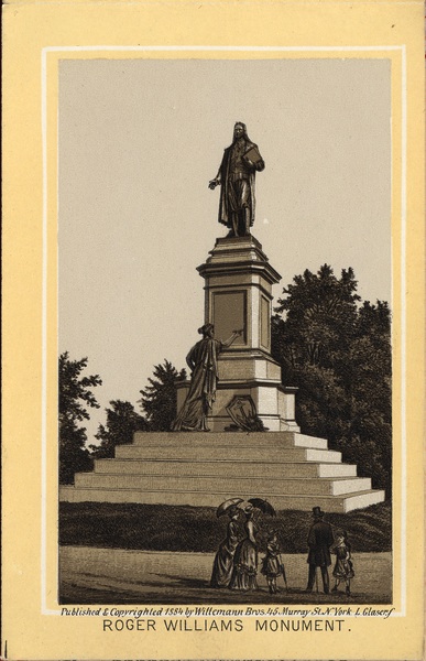
This got me reflecting on Roger Williams and our collections. As I was sitting at my desk I looked out the window and realized I was looking at the First Baptist Church in America, established by Roger Williams in 1638. This is the first and oldest Baptist church in the New World. Williams belief in the practices of the church wavered throughout his life, but he remained steadfast in his defense of religious freedom, and his influence caused Rhode Island to be a unique haven of religious liberty in the seventeenth century

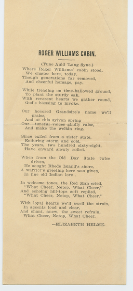
The story of Roger Williams’ search for religious freedom and expulsion from Massachusetts is repeatedly told. Here it appears in a broadside to be sung to the tune of “Auld Lang Syne.” As Williams stepped ashore on what is now Gano Street in his search for freedom, he was supposedly greeted by friendly native Americans. The words in the final line, “What Cheer, Netop, What Cheer” were supposedly spoken to the banished Puritan Roger Williams, by the Narragansett Indians as they encountered each other in what would become Rhode Island.

Roger Williams Cabin

“Roger Williams Cabin”

As we begin the holiday season with Thanksgiving, we should keep James Carroll’s opinion piece in mind and “look back gratefully at those who created the American ideal. . . . Roger Williams did indeed create the American soul. He’s the founder to whom, therefore, the nation’s deepest thanks are due. But the way to express such gratitude is by protecting authentic religious liberty from those who, using the phrase as a banner, would destroy it.”

Roger Williams Momument

From Caesar Monuments to Movie Posters

November 15, 2012 by | Comments Off on From Caesar Monuments to Movie Posters

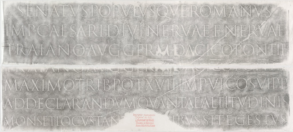
In 2007, the Library digitized two original, loaned rubbings of the inscription from Trajan’s Column (c. AD 113), to facilitate a reproduction request of the Rare Book School’s then Program Director Ryan L. Roth. The rubbings had been made by Edward Catich in 1970, and are now owned by Sheila Waters. Because of their size (two ~9-foot-wide thin-paper sheets), these were digitized in three overlapping shots per sheet, atop a white background, and then digitally merged together to create the final images.

Catich’s rubbing of Trajan’s Column’s inscription.

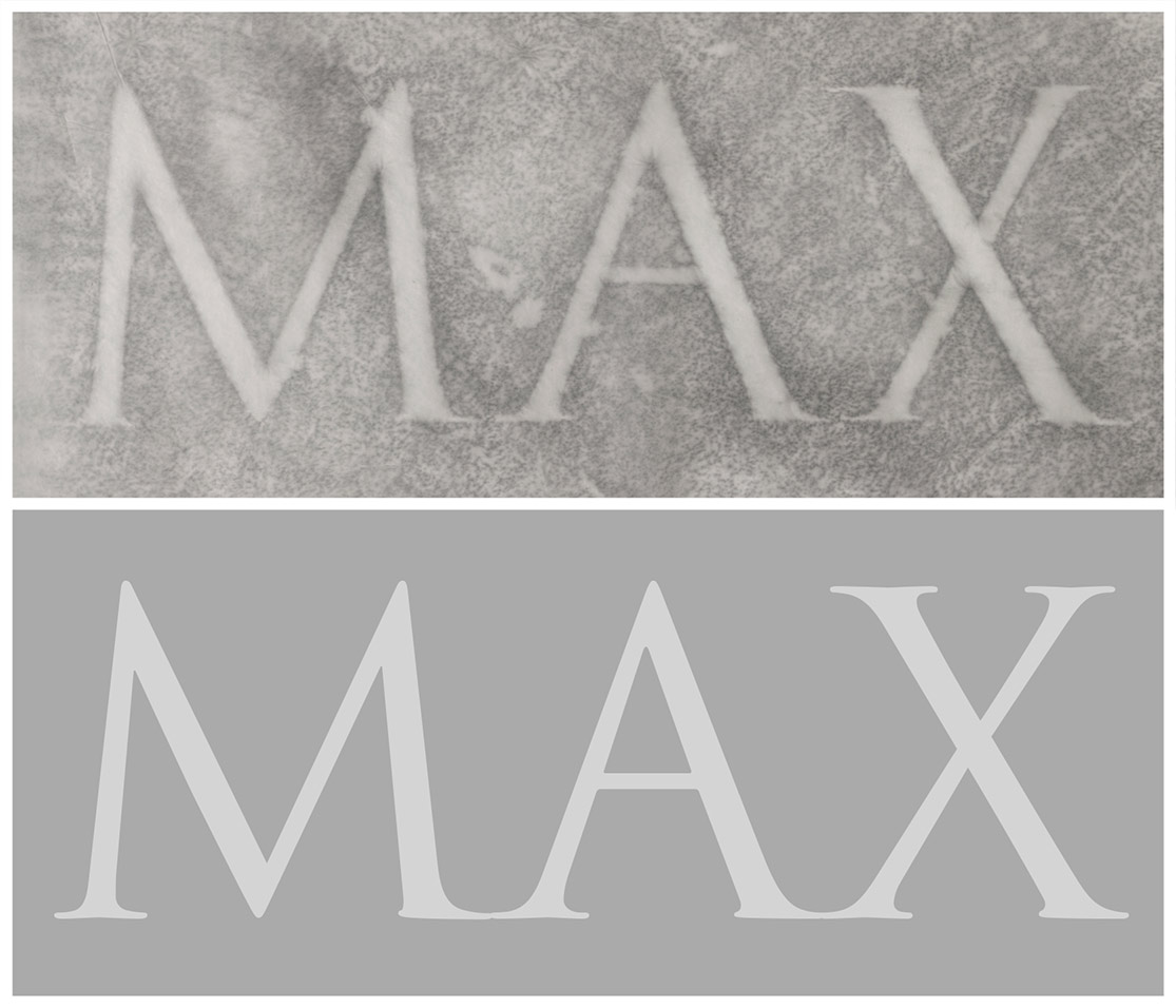
Catich’s research and speculation on Trajan’s Column’s lettering in turn influenced the creation of the now-popular digital font Trajan, first released as a PostScript font in 1989 (designed by Carol Twombly for Adobe Systems).

Top row: detail from Catich’s rubbing; bottom row: matching letters from the digital typeface.

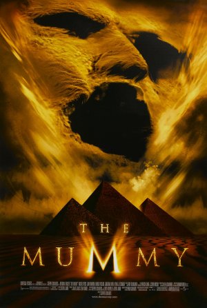
Ever since, starting in the early 1990s, and often as an affront to many graphic designers’ sensibilities, the Trajan font has been featured on an inordinately high percentage of American movie posters — even to the extent that the Roman lettering style is now associated with both Japanese Samurais and Egyptian mummies.

Trajan in The Last Samurai

Trajan in The Mummy

Walt Whitman’s Manhattan of the 1840s

November 9, 2012 by | 1 Comment

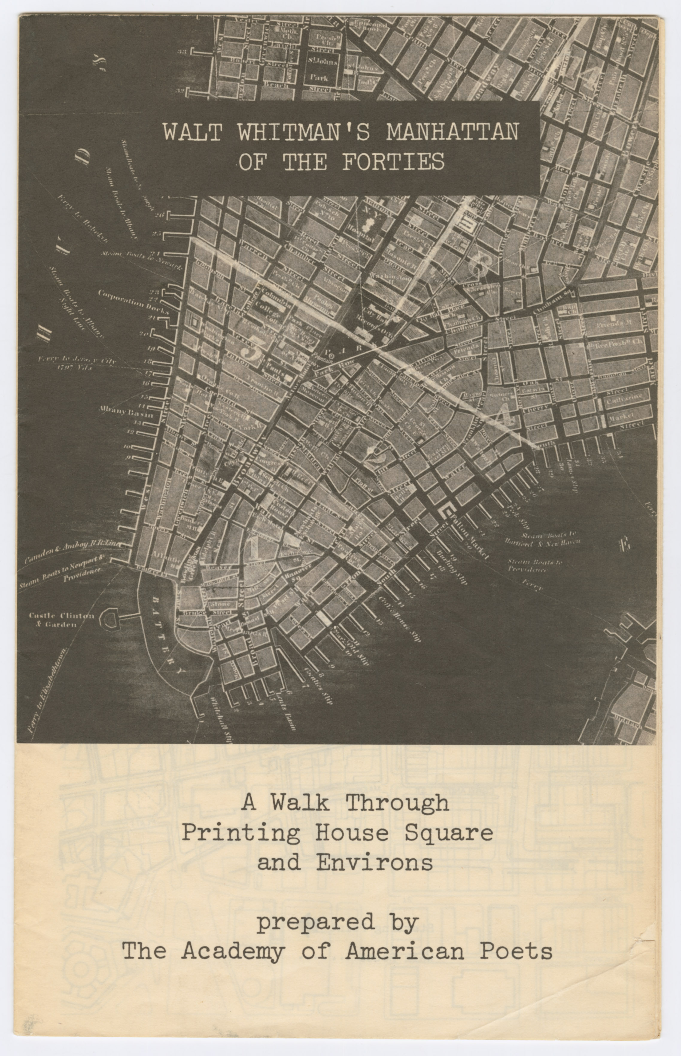
There are over 13,000 broadsides from the Harris Broadsides Collection currently available in the digital repository, with more being added as we work our way through digitizing the collection. This week, a brochure prepared by the American Society of Poets in the 1950s stood out as an artifact of interest. Walt Whitman’s Manhattan of the Forties: A Walk Through Printing House Square and Environs features a walk which reconstructs aspects of Walt Whitman’s New York in the early 1840s, when the city was “speeding toward the line separating the Knickerbocker town from its future materialization as an industrial metropolis”, and is peppered with Whitman’s poetry and anecdotes of mid nineteenth century life in the city.

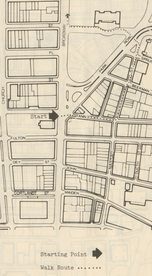
The walk begins at St. Paul’s Chapel crosses over Broadway, continues up Ann, with a left onto Nassau to Park Place, on to City Hall, ending at Duane and Broadway. The brochure identifies sites and buildings with Whitman’s early career, at the time when he started to write for the newspapers. “It was here that Whitman worked as a reported in a milieu of corrupt politicians, cutthroat newspaper practices, yellow journalism.” The reader is urged to try and visualize Whitman at age 22, “a natty dresser, he probably looked like his stylish counterparts, who piddle and patter here in collars and tailed coats.”

The buildings and sites identified along the walk are the Astor House, the American Museum, The Evening Tattler (where Whitman served as editor in 1842), the printing shop of Park Benjamin (where Whitman worked as a printer upon first arriving in New York), and The Evening Mirror (Edgar Allan Poe began writing for the Mirror in 1844 and spent his noon hours across the street at Sandy Welsh’s (a famous beer cellar and popular hangout for newspaper men.) The New York Leader, Fowler’s Phrenological Cabinet (“where charts and physiological exhibits were on display to advertise this pseudo-science”), The Broadway Journal (also edited by Poe), Democratic Review, Tribune, Evening Post, The Aurora, The Evening Tattler, and Printing House Square are also identified. Printing House Square is the former home to The New York Times, The Sun, and the Tribune. All that remains of the square today is a memorial plaque and statue of Benjamin Franklin. The walk continues past Tammany Hall, the Empire Club (“gathering place for Five Points gangsters”) , Five Points (at that time, “a squalid cesspool of crime”), City Hall Park, the Tabernacle (deplored by contemporary writers as “a huge unsightly pile” and “a dingy mongrel place”), and many Boarding Houses, where in the 1840s “possibly more than half the population of the city lived, not only single young men like Walt Whitman, but couples like Mr. & Mrs. Edgar Allan Poe.”

The brochure cites several texts, suggesting that “taking one or two along on this tour would give the walker the best of all companionship.” The following titles from the list are available at the Brown University Library.
The times of Melville and Whitman
Last days of Knickerbocker life in New York
Nooks & corners of old New York
A tour around New York, and my summer acre
Domestic manners of the Americans
The memorial history of the City of New-York, from its first settlement to the year 1892
Autobiographia; or, the story of a life

Sanskrit Friday

November 2, 2012 by | Comments Off on Sanskrit Friday

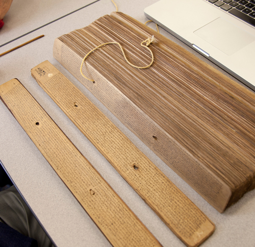
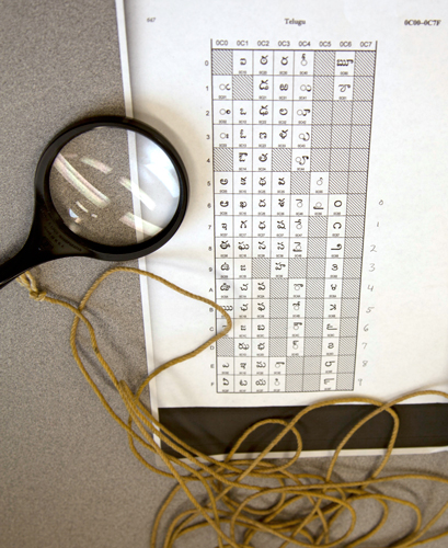
I was lucky today to work with two Sanskrit scholars, Peter Scharf and Susan Moore (both affiliated with the Sanskrit Library), to photograph some missing leaves in our palm leaf manuscripts digitization project. Palm leaf manuscripts are actually just what they sound like: they are manuscripts made from dried palm leaves, onto which scribes would etch the lettering and then apply dry ink, often black soot, over the etched letters. This practice is more than 2,000 years old, although with the need to recopy the leaves due to condition problems, many leaves we see today are much younger. The manuscripts are in sections, and each section is bound together with cord that runs through holes in each leaf. Our visiting scholars helped determine which leaves we needed to photograph (some of the manuscripts are in Sanskrit, some in Telugu), disassembled the manuscripts, and ensured that the leaves remained intact and in order.

Disassembling the manuscript

Reading the numerical system in the manuscript

Here’s an example of a typical palm leaf from these manuscripts (with color targets, which we include for our archival copies):

Some of these manuscripts are centuries old, and bear the marks of their age. The below manuscript shows that the leaf was partially eaten, presumably by a worm:

Another issue we run into with the manuscripts are leaves that have not been inked – when the leaf was etched by the scribe, but ink was never added to the etching. Here’s an example (at 100% magnification) of two separate palm leaves. One has been inked, while the other has only been etched. To be able to capture this properly, I had to tilt one of our lights at a very low angle to the manuscript, so that the raking light would fill the embossed letters and make them legible.

Although challenging, these manuscripts were fun to photograph. Part of what makes this work so interesting is the wide variety of materials we have, and the scholars, curators, and researchers that we get to work with.