Digital Production Services Homepage Brown University Library Homepage Brown University Homepage

c u r i o

Imaging rare, unusual, and intriguing objects at the Brown University Library

Stereoscopy Digitized

May 21, 2015 by | 1 Comment

Last fall, the Brown University Library acquired a set of 100 stereographs made of Palestine in 1901. Stereographs are made using stereoscopy: a technique that involves creating the illusion of three-dimensional space using two-dimensional imagery. In photography, this means making two images that are just slightly offset from each other, and using a special viewer (a stereopticon) to look at both images at once. The illusion of depth between different spatial elements emerges as our brains attempt to reconcile these two different images into one, creating a (seemingly) three-dimensional scene.

Palestine-Full

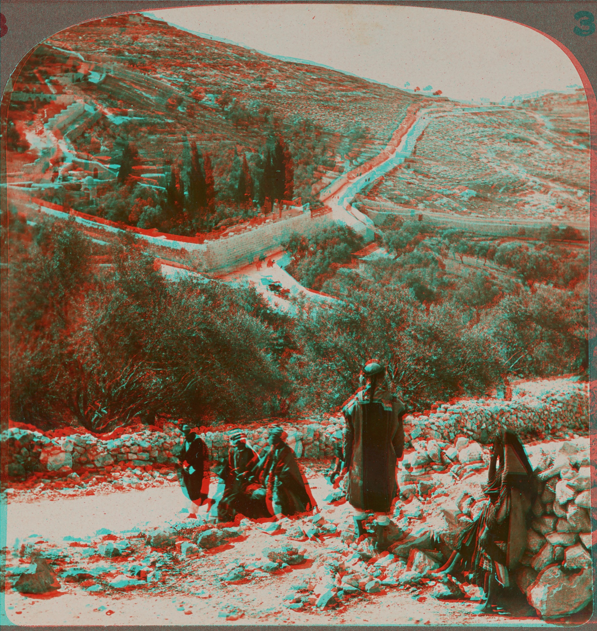
One of the stereographs of Palestine, showing the two offset images that will eventually form the single three-dimensional image.

As is the case with most stereographs of this kind, these photographs are albumen prints that have been mounted onto thick card stock. Over time, many of these cards develop a curvature towards the mounted-print side. This makes it very difficult to digitize the images using a flatbed scanner; you can’t get even focus or lighting on a non-flat object, and it’s easy to rip the images or crack the emulsion of the photographs if any attempt is made to flatten the cards. This set of stereographs was no exception, and many of the cards had a distinct curve to them. To account for this, I digitized them using our reprographic camera so I could light them effectively and avoid the need to flatten the object altogether.

3dslidermaker

The next step was to create a three-dimensional image from each stereograph. There are a number of software applications that enable the user to merge two images from a stereograph into a single image that can be viewed as three dimensional using 3d glasses. I chose 3d Slide Maker, a freeware Macintosh application made by Mike Cook. This software lets the user upload the left and right sides of the stereograph, and then adjust the level of offset on the horizontal and vertical axes. It’s easy to view changes are you make them, so if you have a set of 3-D glasses you can check your work as you edit. This software also allows for additional imaging adjustments to correct any problems that creating the final 3-D image, or anaglyph, has caused in the image quality.

Once each new image was complete and exported, it was added to the collection of images. Each stereograph has three images associated with it: the front of the card; the back of the card (many of these have writing about the scene pictured on the front); and the 3-D anaglyph. If you have 3-D glasses, you can view the image below as a representation of what viewing the stereograph using a stereopticon might be like. You can also click here for an animated gif that shows the offset of the images.

Palestine033_03d

This collection will be displayed at Brown through 100 stereoscopic viewers in Fall 2016, curated by Ariella Azoulay and Issam Nassar, under the title Time Travelers in Palestine – Stereoscopic Journey.

Reconstructing the Berrigan Airplane

May 6, 2015 by | 2 Comments

Brown University Library’s Harris Collection of American Poetry and Plays, housed at the John Hay Library, contains a wealth of poetry-related ephemera. A promotional flyer from 1969 — designed to become a paper airplane glider — was recently acquired for the collection. The flyer advertised a February 5, 1969 reading at the Poetry Project at St. Mark’s Church (New York City) by Ted Berrigan (1934–1983; born in Providence, RI). As the previous owner of this item noted, the flyer itself was likely designed by Joe Brainard, who had collaborated with Berrigan in the past. (The original artwork resides in the Henry W. and Albert A. Berg Collection of English and American Literature at the New York Public Library.)

Since the flyer only becomes fully legible when folded, we decided to reconstruct the plane: our high-res. photos of the newly acquired printed copy, digitally processed to use as high-contrast line art, became a double-sided print ready for folding. Shown below is a view of one side of the flattened flyer, the reprinted flyer assembled as a paper airplane (underside view), and evidence of a successful test flight.

flat artwork

Flattened newly-acquired print

Preflight snapshot of reprint

Preflight snapshot of folded reprint

test flight

Test flight

Portrait un-retouching

April 21, 2015 by | 1 Comment

A few weeks ago, I was given a photograph to digitize – a pretty standard request in DPS. The photograph is a portrait of Alexander Nesbitt, co-founder (with his wife Ilse Buchert Nesbitt) of the Third & Elm Press; the Brown University Library has a sizeable archive that includes “art and design work from the Third & Elm Press; in part, joint art and design work of Alexander Nesbitt and Ilse Buchert Nesbitt for other than Third & Elm; and in part the papers of Alexander Nesbitt, including correspondence, writings, miscellaneous papers, academic papers, non-academic lectures, biographical/personal materials, and museum objects” (from Brown University Library catalog record).

beforeIt’s a lovely portrait, and one of the only portraits of him from that time period. The only problem? At some point, the image was retouched to mask out a large area around Mr. Nesbitt’s face – giving this unusual halo effect that proved very distracting. Normally, our archival digitization workflows aim only to capture the originals as accurately as possible, but this was a special case for this particular collection, so we decided that we would keep two copies of the scan that I’d made. We kept one version that included the original retouching, and a new version where I eliminated the halo, and attempted to recreate as best as possible the image underneath. We would add both versions to the Brown Digital Repository, and also wanted to be able to make new prints of the image – printed using archival processes and fine art papers – that we could use for display to protect the original from damage.

The photograph itself was also showing some aging and use problems: there were some minor color shifts in the photograph (the sepia-ish light brown tone was turning to yellow-orange in the highlights), and there were some bends and tears in the paper. I was able to correct those relatively easily using straightforward image processing techniques. I also removed some dust and scratches from the original printing. Then, I moved on to the main job: removing the while halo, and recreating all the areas underneath the white mask. This was relatively easy to do when it came to the background, but when it came to Mr. Nesbitt’s neck, suit, shirt, and tie, it was far more challenging to recreate an accurate and convincing image.

I was able to determine how to recreate the tie relatively easily – I did basic image searches for men’s ties and tried to find some good matches to work from. The shirt and coat lapels were trickier, because they’re a specific style. The coat lapels in particular required a little more investigation, especially to get the notch correct and to make sure the angles and spread looked right. Here, my research led me to Hollywood:

indy-kings

Left: Screenshot from Indiana Jones and the Temple of Doom, © 1984 Lucasfilm, Ltd. Right: Still from The King’s Speech, © 2010 The Weinstein Company.

I used these images from Indiana Jones and the Temple of Doom (1984) and The King’s Speech (2010) as guides in recreating the suit jacket for Mr. Nesbitt. I did not use the images to add to the file I was working on; rather, I used them as reference as I recreated the lines, textures, and shadows of the jacket through various processing techniques. When retouching was complete, we had prints made of both images: the original with basic color adjustments and tear repairs, and the fully retouched version with the halo removed. Here’s the before and after, from raw scan to completed file:
before-after

Black, blue, and gray all over

March 18, 2015 by | Comments Off on Black, blue, and gray all over

Last month a blue-and-black dress sparked a mass-scale debate about color theory. Even the New York Times and magazines like Wired eventually weighed in, explaining how color perception is contingent upon context and light sources.

In honor of the unexpected media attention to color theory, Curio features below a gray-and-black dress from c. 1866, reproduced from Fashion in Paris: the Various Phases of Feminine Taste and Aesthetics from 1797 to 1897 (New York: C. Scribner’s Sons, 1898) for the Library’s Paris: Capital of the 19th Century online project (the project’s items are also available via the Brown Digital Repository).

black-and-gray-dress_DPS

Page from Digital Production Services

This illustration was hand-colored for Uzanne’s book, and the tones used to represent the dress were not painted as scientifically neutral-gray hues. Traditional representational painters counsel “never use black paint” when rendering scenes, since in reality even black rarely visually appears as “pure” black, depending on the particular light sources illuminating an area. Scanning or digitally photographing hand-painted artwork often only exacerbates color uncertainty, if images are captured without a known neutral-gray or neutral-white reference point. For example, the same page illustration, scanned for Google Books’ digitized version of the volume, ends up looking even more blue-cast, at least in part due to the contrast-boosting post-processing applied to Google Books’ page images:

black-and-gray-dress_GB

Page from Google Books

To test your color perception, try X-Rite and Pantone’s Online Color Challenge (taking the test on a calibrated and profiled monitor definitely helps). By chance, coinciding with the media frenzy about the black dress on Tumblr, the philosopher of perception and consciousness David Chalmers — who has written about color perception — was giving a series of Royce Lectures at Brown, February 24–27.

The Unicorn of the Sea Comes to Brown

March 10, 2015 by | 2 Comments

I often write about techniques to photograph unusual objects, or situations that involved photographing objects on site. This past Friday, however, we had the unique pleasure of photographing a very rare and unusual object while it was being installed for exhibition.  My colleague and I photographed a narwhal tusk from the Paul C. Nicholson Whaling Collection of the Providence Public Library, on loan to Brown for the exhibit Unicorn Found: Science, Literature and the Arts. The exhibit, as well as a special Unicorn Colloquium the afternoon of March 11, are part of the larger, multi-institution Unicorns in Residence: Providence event this spring.

tusk01

The Narwhal tusk is remarkable to view in person; I was surprised at its size (56″ long), and its hollow, spiral structure. In a previous discussion about photographing this object, it was decided that the safest and most efficient time for photography was during installation of the tusk, so it would be handled as little as possible and by the folks who specialize in handling these materials. (While my colleagues and I are familiar with many special handling techniques for rare and fragile objects, the narwhal tusk requires multiple people to handle, and while its age is unknown it is a decidedly delicate object.) All object handling was done under the direction of Jordan Goffin, Special Collections Librarian at the Providence Public Library, with the assistance of Rachel Lapkin, Materials Conservator at Brown (who also made the stands that support the tusk), and Sarah Dylla, a Public Humanities graduate student at Brown working on a fellowship in Special Collections.

tusk-setup

The tusk in its display case at the Hay, prepared for photography with gray backdrop and studio lights. The camera, tethered to an out-of-frame laptop, is mounted on a tripod on a table to obtain a suitable height and distance from the object.

The tusk is housed in a display case that can be viewed either from the main lobby or the Grand Reading Room at the Hay. After looking at the space prior to photography, we decided to photograph the tusk in its display case, with a neutral gray backdrop set up temporarily for photography. We set up the backdrop, two lights to illuminate the tusk, and then the tusk was moved into place. We had decided to photograph it from several angles – straight on, and from multiple side and front views –  so we made several images from one vantage point, and then moved on to additional angles and views.

tusk-details

Alternate views and detail of the narwhal tusk.

The tusk, and a number of other curious unicorn-related materials, will be on display in the John Hay Library in the renovated lobby cases and Willis Reading Room cases from March 11 – July 31, 2015.


Capturing the Transit of Venus

March 2, 2015 by | 1 Comment

Recently, as part of Brown’s 250th celebration, my colleague and I were asked to photograph a selection of the many historical objects at Brown. Among these was the Transit of Venus telescope, a Gregorian reflecting telescope made by Watkins and Smith of London, and donated to the University by Joseph Brown. The telescope is named for the event it was purchased to observe: the movement of Venus across the sun. The transit of Venus was observed by Brown, Benjamin West, and others on June 3, 1769 – and more recently on June 5, 2012.

venus-main

The final version of the Transit of Venus telescope, photographed on site in the Lownes Room.

Thankfully, my colleague and I did not need to address any planetary movements to photograph this object; however, we did need to photograph it on-site in the Lownes room at the John Hay Library. We brought our backdrop, lights, and camera, and it was a relatively simple setup. We were careful to set up the camera so that the lens and angle of view did not distort the telescope in any way; our main challenge was actually positioning the lights. The telescope is incredibly reflective, and while changes in tone help show the shape of the telescope, and some highlights are useful for showing surface texture, initially we were getting long streaks of blown-out highlights, causing a visual distraction within the overall image.

venus-setup

Our straightforward lighting setup gets the job mostly done – all we have to deal with is the large highlight streak in the center of the telescope.

After trying multiple approaches – from changing the position and distance of the lighting, to a system of reflectors – we decided that our best option was to make two captures to merge together. To keep image distortion to a minimum, we decided to keep the setup largely the same, but to reposition the angle of one of the lights for each shot. Once finished, we had one image that was properly exposed except for a blown-out streak on the right side; and another with the lighting problem on the left. Layered in Photoshop, it was easy to merge the images to create a single image that accurately captures the telescope without the distracting highlight.

venus-in-merged

The two vies of the telescope – the only differences are the positions of the highlights, created by repositioning and changing the angle of our lighting equipment to reduce the glare.


Photographing the Edwards Cane

January 23, 2015 by | Comments Off on Photographing the Edwards Cane

Shortly before we left for our holiday break, I had another opportunity to photograph historical materials and objects from the Brown University Archives. We’ve had a number of interesting objects come through lately as part of Brown’s 250th celebrations, and since we often are photographing books and documents, three-dimensional objects can be a treat to have in the studio.

One of the more challenging objects that I got to work with is known as the “Edwards Cane,” a cane that belonged to Morgan Edwards, an important figure in the founding of Brown University. The bottom of the cane is rounded and does not stand on its own; it also has an ivory head with a small silver plate bearing an inscription. It was important to shoot both the cane overall as an object, but also focus in on the inscription.

cane-views

Edwards Cane; full shot (L) and detail of inscription (R). The hole in the cane visible in the detail shot, just below the ivory handle.

Usually, when we are given more complicated objects to photograph, it’s the nature of the surface materials that presents the greatest challenge: oil paintings, for instance, that are prone to glare; or objects made of silver or glass, which require the construction of light tents in order to capture the details of the object without also capturing our own reflections. The Edwards Cane, however, posed a new challenge: how to adequately support the object while keeping the intrusion of the support elements into the image at a minimum. The best way to photograph it would be to build a support that gently but firmly clamps onto the cane and holds it at a precise position, so we could have the exact angle we wanted without damaging the cane. However, despite multiple attempts, I was unable to find any support mechanism that would support the cane well, not allow any movement, not cause any damage to the cane, and not be incredibly difficult to digitally remove from the final image.

cane-tape

The cane with packaging tape support.

And then I found the trick. The cane actually has a hole running through it a few inches below the top, visible in the detail of the inscription. The hole runs through the width of the cane and is lined in metal; it’s sturdy, and at just the right spot as a center of gravity of sorts. It was perfect – I just had to find the right material to run through this hole to keep the cane supported and at the correct angle. After trying multiple types of rope, twine – even extra strong fishing line – the material that worked best was regular clear packing tape. When folded over itself, the packing tape leaves no residue behind on the object, and it’s possible to fold it in odd shapes as you go. This was important, because I was able to create small bumps on either side of the cane, which did not cover any of the object when photographed but did keep the cane perfectly in place. The cane is very light, so this turned out to be the perfect option for keeping it in place. I ended up using two additional, much more powerful tapes to attach the packaging tape support to the wall and desk of the studio, to keep the cane in the correct position (this technique actually allowed me to change positions easily, so I could angle the cane and capture the inscription without having to reposition the entire setup).

Once the support was in place, the rest of the setup was straightforward. I positioned two lights with umbrellas as well as a simple grey backdrop, and was even able to shoot tethered with our high-resolution digital back (very important in checking the focus, especially on the inscription). I was able to capture the front, back, and a few details relatively easily, only needing to move the lights and slightly adjust the angle of the cane. Adjusting the cane was not a problem, but I waited approximately two minutes after I made any adjustments for any movement I created to cease. The final images did require some minor retouching – mainly just removing the evidence of tape from the grey background. The result was a set of high-resolution, clean final images that show all the important elements of the cane, and further proof that no photography studio can have too much tape on hand.

cane-setup

The final setup for photographing the cane, showing the packaging tape support attached to the studio wall and desk, the camera tethered to our capture computer, and a basic lighting setup.