Digital Production Services Homepage Brown University Library Homepage Brown University Homepage

c u r i o

Imaging rare, unusual, and intriguing objects at the Brown University Library

Napoleon’s Death Mask

January 23, 2013 by | 4 Comments

While the bulk of my work involves the digitization of two-dimensional documents, or straightforward photographs of pages from books, I also photograph other types of items – like the 360 degree photography, and the interiors that I have posted about. Every once in a while, I get more unusual requests. Since I am usually the person who handles three-dimensional items, I get to photograph some of the most interesting – and unexpected – items from our collections.

Two years before this shoot, I actually photographed a portrait of Napoleon; an oil painting by Vernet in a gold-colored frame with the familiar bee (a symbol of immortality and resurrection) carved onto the front. It’s a part of the William Henry Hoffman Collection on Napoleon I and it’s absolutely stunning. Actually, the entire collection (of approximately 600 items) is fascinating, so I was excited when I was called over to look at an object that needed digitization. I was a little surprised to find it was not exactly a portrait of Napoleon; it was a plaster cast of his death mask. The request had come internally; we have a series of talks on our Special Collections at Brown, and this image was to help publicize and showcase a talk on the mask, given by Peter Harrington, curator of the Anne S.K. Brown Military Collection.

I had to bring it back to my studio at DPS to photograph, as I needed better light than I could get in the room the mask is stored in. I set everything up before bringing the mask out of its box; I was using hot lights, and the less exposure the mask has to the heat and drying nature of the lights, the better. Using a stack of books about the same size and shape of the mask, I set up foam to cushion it on a low table, set up lights equidistant and at the same angle to the object, and utilized the horizontal arm of our tripod so that I could shoot straight down onto the object. I used a color checker card to make sure that my white balance and exposure was correct, I tripled-checked the depth of field and focus, and then was ready to go.

As is often the case when dealing with unique objects, the setup took much longer than the actual photography. I replaced the books very carefully with the mask, took approximately 10 shots at slightly different exposures and focuses at three different angles. I ended up with a high resolution photograph of the death mask, and a great response when people asked me what I was bringing around the library in a box.

360 Degrees of Advent

December 7, 2012 by | Comments Off on 360 Degrees of Advent

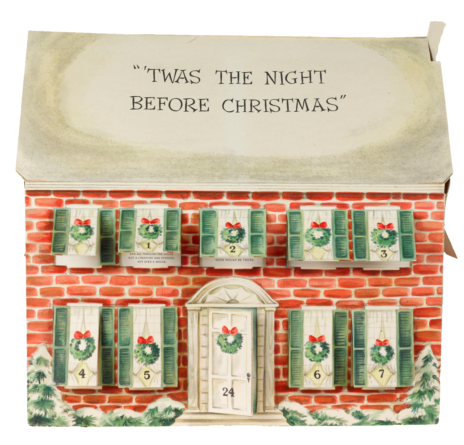
Advent Calendar – main view

Although I generally photograph books and flat documents, I occasionally have the opportunity to photograph three-dimensional objects. Depending on the type of object (this fold-up calendar, cuneiform tablets, a mummified crocodile!), I use different lighting setups and camera techniques. As I photograph these rare objects, I’ve become more and more interested in trying to represent them in as close to three dimensions as possible.

In lieu of a 3-D scanner, I have been experimenting with creating 360˚ rotating views of the objects. Done as sort of a proof-of-concept project, I photographed this Advent calendar, part of our Harris Broadsides Collection, using 360˚ rotating processes.

The process is actually pretty straightforward: you set up your camera and lights (all your settings and positioning must stay the same); and your object must be stable, and centered on a surface that can be rotated in small increments (as close to every 5˚ or every 10˚ as possible). While you can buy these devices, we took a more DIY route and made one using a lazy susan. To ensure that I rotated each shot only 10˚, my coworker generated an Adobe Illustrator file that had each 10˚ marked out exactly. While we have since started using a 5˚ model for better accuracy and more smooth rotations, it worked quite well:

The two different printouts I use when making 360˚ images.
Left: the printout used for this setup, with markings every 10˚, yielding 36 shots;
Right: our newer printout with markings every 5˚, yielding 72 shots.

I then used the Illustrator printout to mark off 10˚ on the lazy susan, centered the calendar on the surface, and began shooting. I lined up a spot on my shooting table which I could line up with each marking, and made my shots. I ended up with 36 images, and removed the background from each one.

Advent-10
The Advent calendar with background, showing its placement on the lazy susan and the 10˚ markings used in capture.
Advent 10-2
The same image, with the entire background masked out using clipping paths (just as in the “Coffee Pots and Clipping Paths” post).

While we can upload the images to the web and create interactive rotation using HTML5 & JavaScript, we can also produce movies that allow for a similar viewing experience. We also hope to work with our repository team to add zoom and angle-of-view functionality. Below is a sample movie:

Sanskrit Friday

November 2, 2012 by | Comments Off on Sanskrit Friday

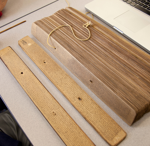
I was lucky today to work with two Sanskrit scholars, Peter Scharf and Susan Moore (both affiliated with the Sanskrit Library), to photograph some missing leaves in our palm leaf manuscripts digitization project. Palm leaf manuscripts are actually just what they sound like: they are manuscripts made from dried palm leaves, onto which scribes would etch the lettering and then apply dry ink, often black soot, over the etched letters. This practice is more than 2,000 years old, although with the need to recopy the leaves due to condition problems, many leaves we see today are much younger. The manuscripts are in sections, and each section is bound together with cord that runs through holes in each leaf. Our visiting scholars helped determine which leaves we needed to photograph (some of the manuscripts are in Sanskrit, some in Telugu), disassembled the manuscripts, and ensured that the leaves remained intact and in order.

Disassembling the manuscript

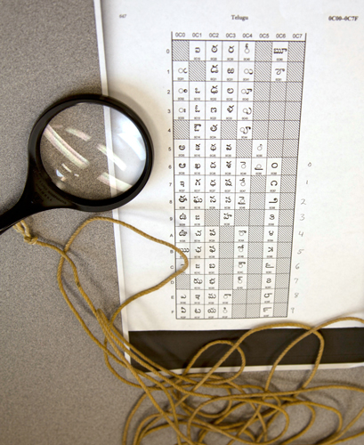
Reading the numerical system in the manuscript

Here’s an example of a typical palm leaf from these manuscripts (with color targets, which we include for our archival copies):

Some of these manuscripts are centuries old, and bear the marks of their age. The below manuscript shows that the leaf was partially eaten, presumably by a worm:

Another issue we run into with the manuscripts are leaves that have not been inked – when the leaf was etched by the scribe, but ink was never added to the etching. Here’s an example (at 100% magnification) of two separate palm leaves. One has been inked, while the other has only been etched. To be able to capture this properly, I had to tilt one of our lights at a very low angle to the manuscript, so that the raking light would fill the embossed letters and make them legible.

Although challenging, these manuscripts were fun to photograph. Part of what makes this work so interesting is the wide variety of materials we have, and the scholars, curators, and researchers that we get to work with.

Almost as long as the river itself

October 19, 2012 by | Comments Off on Almost as long as the river itself

Recently, I was working on a patron request that involved photographing multiple foldout maps from a range of books. Foldouts in books are always tricky, and involve both conservation and photographic issues.
I like to work with a “First, do no harm” mentality when dealing with fragile materials; if I have any concern that they might be damaged during digitization, I head directly over to our Conservator. In fact, there were two books in this request that I did not photograph, because their foldout maps where either too fragile or too brittle to unfold (I find paper that’s been folded for over a century or so likes to stay folded).

Once I know that I won’t damage the foldout, the next challenge is to photograph it. This means supporting the entire foldout (usually with foam sheets) and making sure it’s as flat as it can safely get. From there it’s a dance of sorts to make sure the entire object is evenly lit (tough when you have creases that create shadows) AND that the entire expanse of the foldout is in focus (especially difficult when it doesn’t unfold completely flat).

We do sometimes run into foldouts that require photographing in multiple steps and stitching the pieces together. In these cases we are very careful to replicate the circumstances of each image exactly (i.e. with lighting and focus), and stitch the image together in Photoshop without changing the object in any way.


This image comes from Chisholm’s All Round Route and Panoramic Guide of the St. Lawrence: the Hudson River; Saratoga; Trenton Falls; Niagara … the White Mountains; Portland; Boston; New York, published in 1874. The book itself is five inches wide by 7.5 inches tall – the map is about 7.25 inches wide and almost 13 feet long. The vertical image on the left shows the length of the map, shot as nine separate images and stitched together very carefully in Photoshop.

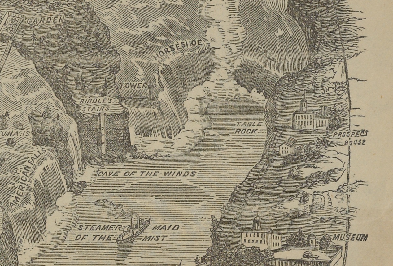
Because the map was actually quite flat, I was able to shoot directly on our reprographic stand. Our camera is very high resolution (80 megapixels), as you can see with this detail shot, taken as a screen shot when the image was enlarged to 100%.

This map happens to be of the Niagara River, so we see Horseshoe Falls and even “The Maid of the Mist.” The entire map is this detailed, and it’s pretty amazing to see such a large map fold out of such a relatively small volume.

The map did photograph easily, but parts of the map had already torn (as visible in the long image, where you see some small breaks in the map). This went straight to Conservation after photography. Also visible are the color targets we include in each shot (I only included six of the nine I used; once for each shot). These ensure that our exposure, color balance and resolution are set properly to ensure an archival file viable for many future uses.


Setting up shop in the Lincoln room!

September 17, 2012 by | Comments Off on Setting up shop in the Lincoln room!

While many of the items we photograph are done in our studio, we do occasionally need to photograph items or objects where they reside at Brown. This is usually due to their size or other constraints that makes moving them too difficult. It then gives us the challenge to both light the object as well as safely maneuver ourselves and our equipment in a variety of spaces.

Baumgras-Lincoln

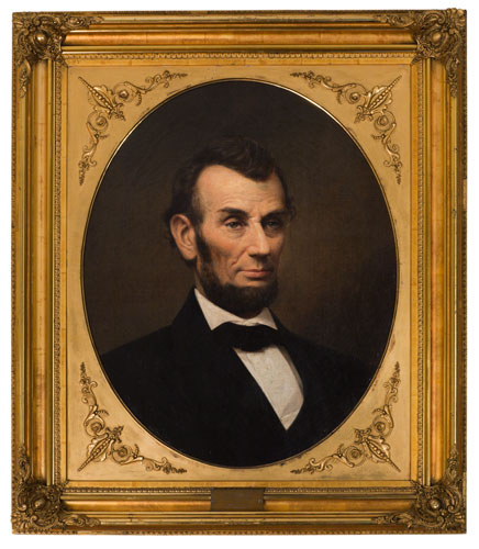
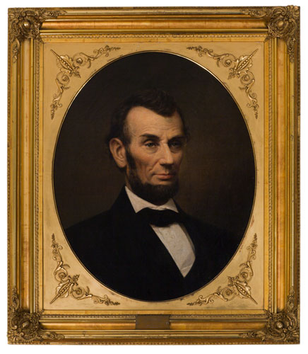
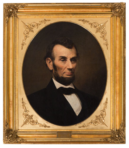
This is exactly what happened when I photographed this portrait of Abraham Lincoln by Peter Baumgras. Part of the Charles Woodberry McLellan Collection of Lincolniana at Brown, the portrait is housed in the Lincoln room at the John Hay Library. Beautifully framed, it’s a lovely portrait to shoot.

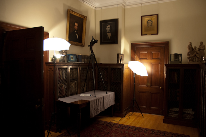
But it’s hung very high on the wall, at a significant angle, without a lot of space to photograph it without distortion. In came our portable lighting setup, our D-SLR (Canon 5D Mark II with 85mm f1.2 L series lens) and tripod, and Macbook Pro (for shooting tethered into Adobe Lightroom).

Lincoln room 1


While the painting itself is opposite the camera (naturally), you get a good idea of my setup here — you also get a pretty good idea regarding why this is referred to as the “Lincoln room.” Due to the height at which the portrait is hung, I had to actually put my tripod up on a table next to the bookcases. I have two hot lights (tungsten-based) with shoot-through umbrellas, which allowed me to light the entire space without lighting the painting too directly. (The painting has glossy oil paint and a highly reflective frame, so keeping reflections to a minimum was essential.)

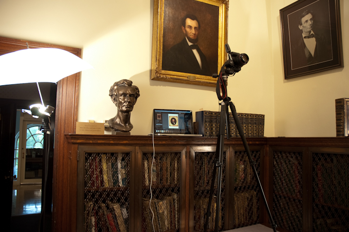
Lincoln room 2A closer shot of the setup shows the camera at an angle. This is not just because the painting is so high – yes, it’s way too high to shoot straight on with the camera, but it also leans forward off the wall by a few inches. It’s not a steep pitch, but enough that it’s easy to get an image that’s just not quite square (i.e. unacceptable).

You can also easily see here that I have the camera hooked up to a laptop for tethered shooting. This allowed me to check the focus, the angle of the camera, the white balance and the exposure all while shooting so I knew I had a usable shot before I packed everything up.

What you can’t see as easily in this shot is that I had to bracket, and ended up using two different exposures, combined into one, for the final image. I used one darker exposure for the bright frame, and a lighter exposure for the portrait itself, which has subtly textured shadows that I wanted to show. In Photoshop, I carefully made a path around the actual painting, and masked out the darker frame. Layered atop the brighter frame, we get the final image, which exposes correctly for both elements of the object.

Lincoln-before Lincoln Bright

1. Dark image, exposed correctly for the frame. 2. Light image, exposed correctly for the painting. 3. Detail of layered image, showing detailing in the frame and the painting.