|
Remains of a Medieval Italian AntiphonalSCRIPT |
The script is a rounded Gothic book script, littera gothica textualis rotunda italiana formata, an Italian liturgical hand. 10 This characteristically Italian script retains the rotundity of Caroline Minuscule, with the lateral compression of Gothic. It is carefully and precisely executed, with a very consistent ductus and equal treatment of letter forms throughout the pages. This aspect is a standard in Italian liturgical texts from the late thirteenth century, through the fourteenth, and far into the fifteenth century. On the witness of the script alone, it looks as if the text was written s.xiiiex - xvin. Manuscripts with the same distinctive features elaborated upon below date from early 1300s to mid 1400s, as listed in the British Library's Catalogue of Dated and Datable Manuscripts, though later examples in this range show characteristics departing from the script found in the leaves. This suggests a date earlier than the turn into the fifteenth century. Figure 2, Add. 39760, shows a script with an almost identical aspect and comparable illumination, dating from 1325. Another similar hand can be seen in Figure 3, Add. 28025, where chant is included, written in 1400. The longevity of this particular Gothic script in Italian liturgical book production decreases the potential for focusing the date of the manuscript within less than the fourteenth century. Fortunately the richness of the leaves, with both chant and illuminations in addition to text, can possibly further aid in narrowing that time period.
Many distinctive features distinguish this script as a specifically littera gothica textualis rotunda italiana formata. The base- and head-lines are strictly observed by all letters except for the ascenders of b, f, h, l, tall s, and t. Descending below the base line are the descenders of g, p, q, y, and x. Included below is a complete sample alphabet as a general reference beyond the specific attributes detailed in this section.
 There
is consistent follow-through of the pen nib to produce flat ends on initial
minims followed by rounded bottoms on final minims,with very straight strokes
and hairline finishes on specific forms. Though initially indistinct, minims
are treated with reliable care and once the precise attributes of m,
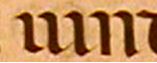
n, i, and u are established they can be easily transcribed.The
v and u, both the same in the chant text, are formed with two rounded
minims connected by the first's finishing upward hairline stroke. The letter
i, as well, ends in a curved bottom with a finishing hairline stroke;
in the first syllable of vindicta, they can be seen in context. The strokes
are identical for the first three minims, forming a u followed by an
i, and the n can then be distinguished by its primary flat bottom.
Although very light and often invisible due to wear on the parchment or the
proximity of the musical staff, the letter i also possesses a slanted
hairline stroke as a 'dotting' function.
There
is consistent follow-through of the pen nib to produce flat ends on initial
minims followed by rounded bottoms on final minims,with very straight strokes
and hairline finishes on specific forms. Though initially indistinct, minims
are treated with reliable care and once the precise attributes of m,
n, i, and u are established they can be easily transcribed.The
v and u, both the same in the chant text, are formed with two rounded
minims connected by the first's finishing upward hairline stroke. The letter
i, as well, ends in a curved bottom with a finishing hairline stroke;
in the first syllable of vindicta, they can be seen in context. The strokes
are identical for the first three minims, forming a u followed by an
i, and the n can then be distinguished by its primary flat bottom.
Although very light and often invisible due to wear on the parchment or the
proximity of the musical staff, the letter i also possesses a slanted
hairline stroke as a 'dotting' function.
 Precisely flat-bottomed
minims come to define the beginnings of the letters m and n. The
rounded tops to all three minims of m have flat endings and a final angled upward
finish.
Precisely flat-bottomed
minims come to define the beginnings of the letters m and n. The
rounded tops to all three minims of m have flat endings and a final angled upward
finish. 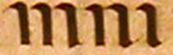 When an m
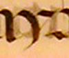
is followed by an i, this difference is clearly evident, defining the
two letters, as in this example on the syllable min. The definite curve
of the i is not the angle of the final foot of m, and so even
through all six minims are equidistant and the heads identical, the feet distinguish
the individual letters. However, in this next example of mni, the bottom
of the final minim of the n is slightly more curved than the bottom of
the third minim at the end of the letter m. More concave than rounded,
the bottom of that last minim of m remains distinct as a conclusion to
the first two flat minims, forming the letter m, while the n and
the i are identified by the upward curved stroke and hairline finish,
creating final minims for both n and i.
When an m
is followed by an i, this difference is clearly evident, defining the
two letters, as in this example on the syllable min. The definite curve
of the i is not the angle of the final foot of m, and so even
through all six minims are equidistant and the heads identical, the feet distinguish
the individual letters. However, in this next example of mni, the bottom
of the final minim of the n is slightly more curved than the bottom of
the third minim at the end of the letter m. More concave than rounded,
the bottom of that last minim of m remains distinct as a conclusion to
the first two flat minims, forming the letter m, while the n and
the i are identified by the upward curved stroke and hairline finish,
creating final minims for both n and i.
 The hairline penstroke,
written with the nib slanted perfectly at the 45 degree angle so to produce
a smooth, thin line, is crucial to the aspect of several distinctive letter
forms for this script.
The hairline penstroke,
written with the nib slanted perfectly at the 45 degree angle so to produce
a smooth, thin line, is crucial to the aspect of several distinctive letter
forms for this script. 
 The
most noticeable is the a, with its dramatic single compartment, angular
and pointed. The outer point of this lobe extends far beyond the top curve of
the central stroke; this accentuation resembles other forms of this script but
retains an individualized style that may be helpful in identifying its scribal
or monastic origin. Also utilizing the hairline stroke in a distinctive way
are the letters x and y.
The
most noticeable is the a, with its dramatic single compartment, angular
and pointed. The outer point of this lobe extends far beyond the top curve of
the central stroke; this accentuation resembles other forms of this script but
retains an individualized style that may be helpful in identifying its scribal
or monastic origin. Also utilizing the hairline stroke in a distinctive way
are the letters x and y.![]() The
x is formed by two curves facing away from each other, with the first
curve descending below the base line in a thin stroke. An elegant rounded broad
stroke creates the first side of the y, with the hairline connecting
the top right stroke. The hairline is also used to close the single compartment
of the e.
The
x is formed by two curves facing away from each other, with the first
curve descending below the base line in a thin stroke. An elegant rounded broad
stroke creates the first side of the y, with the hairline connecting
the top right stroke. The hairline is also used to close the single compartment
of the e.
![]()
![]() For
both letters r and s there are multiple letter forms. Equally
common are the straight-backed and the 2-shaped r, which are not specific
to placement within the word or consistent to particular words.
For
both letters r and s there are multiple letter forms. Equally
common are the straight-backed and the 2-shaped r, which are not specific
to placement within the word or consistent to particular words.

![]() There
are three kinds of s, with the majuscule rounded and the tall s
occurring equally often,
There
are three kinds of s, with the majuscule rounded and the tall s
occurring equally often, 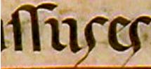 and
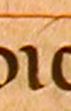
another long, descending s occurring only on two occasions. The example
on the left, excerpted from the words passus es of fol. 15v, exhibits
one of the few instances of the long s outside of its use in the rubrics
for the abbreviation of the word psalm, discussed below.It is unclear why the
scribe decided to use the descending form of the letter in this particular position.
and
another long, descending s occurring only on two occasions. The example
on the left, excerpted from the words passus es of fol. 15v, exhibits
one of the few instances of the long s outside of its use in the rubrics
for the abbreviation of the word psalm, discussed below.It is unclear why the
scribe decided to use the descending form of the letter in this particular position.


 Other
definitive features of this gothica textualis are the two compartment
g and the bilinear d form. These two letter forms also define
the broader existence of the script at all of its stages throughout its development
in late medieval Italy. In the appropriation of z into the gothica
script of Italy, the letter acquires a new ç - like form,
as seen on fol. 15v.
Other
definitive features of this gothica textualis are the two compartment
g and the bilinear d form. These two letter forms also define
the broader existence of the script at all of its stages throughout its development
in late medieval Italy. In the appropriation of z into the gothica
script of Italy, the letter acquires a new ç - like form,
as seen on fol. 15v.
The overlapping of bows, called 'biting', is evident in this script, obeying
the rules of perfected Gothic textura. These rules of biting connections in
other Gothic scripts were taken over into Italy's Gothic textura at the beginning
of the thirteenth century.11
When two adjacent letters with bows face one another, they are placed
close enough to each other for the bows to overlap. Also, when the circular
forms of letters such as o and s follow one another, they overlap,
as do the curved-back of d and the following bowed letter. Despite generous
amounts of space, this biting is a consistent feature when the chant allows
the letters to be close enough to touch. This connection can clearly be seen
between b, p, h, d, and o, when overlapping with
e, o, g, and s.
 |
 |
 |
 |
 |
 |

 Ligatures
also appear on a regular basis, involving the ascenders of the letters s
and t. The f is distinguishable by its longer parallel bar running
across the headline, while the s has only a short dash on the left side.
When an s is followed by a t or another s, they are smoothly
joined at the head.
Ligatures
also appear on a regular basis, involving the ascenders of the letters s
and t. The f is distinguishable by its longer parallel bar running
across the headline, while the s has only a short dash on the left side.
When an s is followed by a t or another s, they are smoothly
joined at the head.
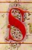
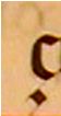
Image Source: Decorated initial 'S' from folio 1v.
Collections Focus Home | Library Home
© 2003, Brown University Library.
All rights reserved.
Comments to: hay@brown.edu
This page was last updated on
Wednesday, 01-Apr-2015 11:53:26 EDT
.
You are the
[an error occurred while processing this directive]
visitor to this page since October 11, 2003.