Digital Production Services Homepage Brown University Library Homepage Brown University Homepage

c u r i o

Imaging rare, unusual, and intriguing objects at the Brown University Library

Ninety degrees of separation

March 22, 2013 by | 1 Comment

When I joined Digital Production Services as a photographer in 2008, one of my first projects was a 15th century bible in the collection of the Providence Public Library. The PPL has a significant Special Collections department, and this bible, Biblicum memoiriale emblematicum, is just one of “over 40,000 books, manuscripts, pamphlets, ephemera, newspapers, maps, broadsides, art, and artifacts, representing over four thousand years of human history and culture.” (PPL website) This relatively small (10.5 x 7.6 cm) bible is handwritten, and many sections are composed of paneled illustrations as if it were an early graphic novel format.

The first step in photographing any rare or fragile material is to consult Preservation. My colleague and I immediately brought the book to our preservation specialist to determine both the best overall handling procedures, as well as any shooting restrictions. The book itself was in remarkably good condition; the main caveat was that the book should not be opened more than 90˚ to preserve the spine. We would have to build a foam structure to support the book and ensure that at no time was there any stress on the spine or the pages.

We also had to take into consideration the specific digitization guidelines provided by the institution that would eventually house the digital version of the bible. The images were headed for the Digital Scriptorium, an online image database for medieval and renaissance manuscripts. Each image required a color target (which we include in every image, but usually crop out for display versions), a grey background, and full-spread views rather than page-by-page views. This was actually helpful for us, since given the handling restrictions on the book, we had to shoot full spreads.

foam-supportMy colleague and I decided it would be best to photograph the object using our glass book cradle. Normally, this cradle is used to photograph one page at a time; it holds the book open to a given page, pressed flat against the glass, and supported underneath by a platform that can be raised or lowered to accommodate different thicknesses. In this case, however, we were using the cradle to house the foam supports for the bible, and to very gently hold the book open; no pressure was put on the bible at all. My first task was to build the foam support, as the entire object needed to be surrounded by protective foam. I cut various strips of foam from larger sheets to reinforce the spine as it rested on the book cradle platform. Next, I cut more strips that I folded and secured with tape to support the back and front of the book, with special attention paid to the areas just beyond the spine. The image below illustrates the foam structure, with a large foam block, stacks of foam and other objects surrounding the support for the grey cloth background to rest on.

 
The next issue that I quickly ran into was that while the book would stay open with very little pressure, it was impossible to keep it open to a given page. To keep the book open would have required using pressure on the book, something that was out of the question in this case. To solve this problem, I created a system where I could place a piece of transparent thread across a page of the book to carefully hold the page in place. I brought in the clear thread, and taped each end to a pencil. I found some large binder clips, which I attached to the book cradle both above and below the book (rather far away so that the thread would not dig into the page). I put each pencil through the metal clip of the binder clip, rotated the pencils to achieve the proper tension, and then locked the clips into place. This allowed me to hold each spread open without damaging the book or interfering with its legibility.

setup-main


Once I knew I could support the book and keep it open to each spread, all I had to do was ensure that the lighting was as even as possible (even into the gutter), and that my focus level was about one-third of the way into the book, so that the focus would be consistent across the pages. Below is an example of the final product; a page from Exodus. You can view the entire book at the Digital Scriptorium.

Exodus

Illuminating Postcards

February 13, 2013 by | 2 Comments

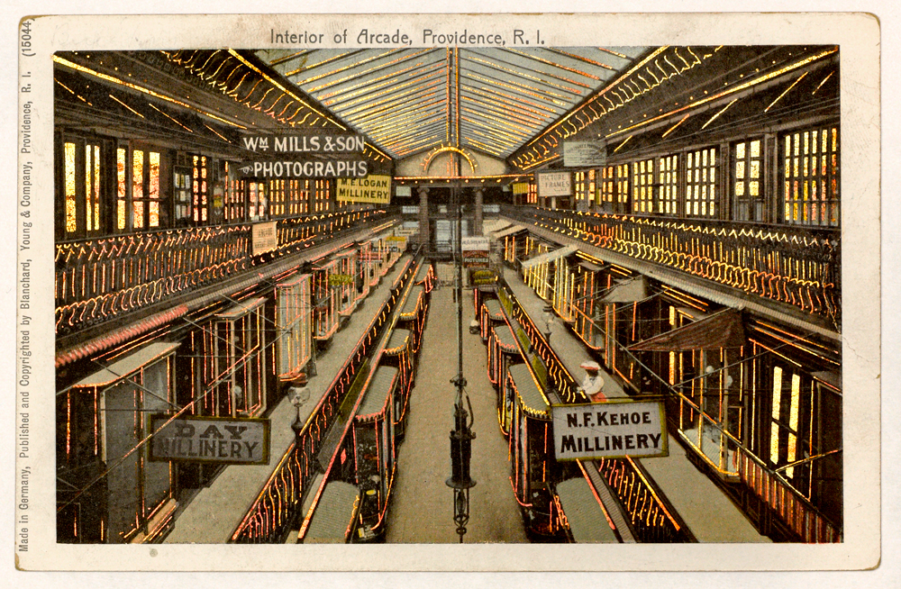
Arcade

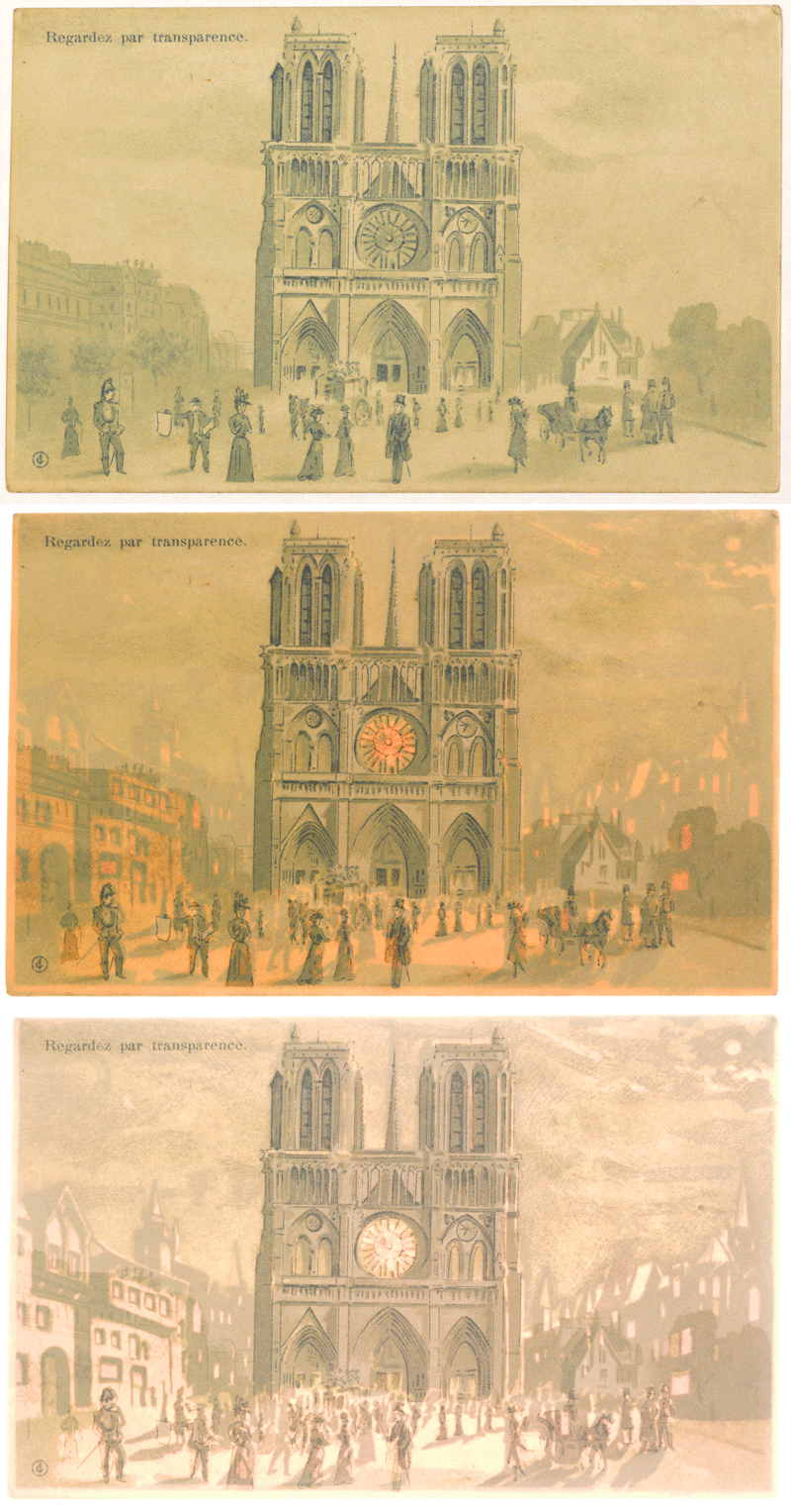
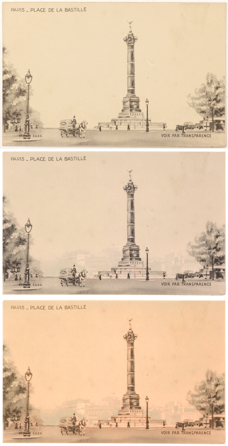
While I generally work with objects and texts from Brown’s Special Collections, I also work with images for the instructional image collection with Karen Bouchard, the Scholarly Resources Librarian for Art and Architecture (she has a Twitter feed for the Brown Imaging Blog). These are images scanned for faculty members (primarily in History of Art and Architecture and Visual Art). For this project, I was digitizing postcards in the personal collection of Brown alumnus Seth Cohen, lent to Professor Dietrich Neumann for use in his lectures. These postcards – representing a range of locations and time periods – look at first like ordinary postcards, but illuminate in specific areas in the card when backlit. Sometimes, the backlighting shines through windows and doors in a bright, copper color; other times, the light brings forth a part of the image unseen when viewing normally.

The following are two animations of illuminated postcards: they start with the postcard lit normally, then move to two different strengths of backlight.

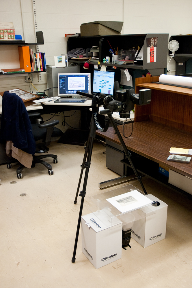
While it’s relatively easy to view one of these postcards – holding them up to a window or to a bright indoor light does the trick – capturing that in a photograph is much more challenging. After some trial and error, I devised a simple system to backlight the postcards with a light strong enough to show the layers of information, while still providing enough ambient light to read the information on the front of the card. I set up our Leaf Aptus II-12 digital back on its medium format camera, attached it to a tripod set to shoot straight down, and did tethered capturing into Capture One (the software we use to capture using our Leaf digital back). I used two Canon 580EXII flash units; one mounted on the hot shoe of the camera, and one functioning as a synched flash on the floor with a Gary Fong Lightsphere diffuser. I used an acrylic box to lay the postcards on, and put that on some boxes so that there would be some room between the flash on the floor and the postcards. I bounced the flash on the camera off the ceiling, so that it would provide a diffused ambient light that would neither overpower the postcards, nor cancel out the backlighting.

Napoleon’s Death Mask

January 23, 2013 by | 4 Comments

While the bulk of my work involves the digitization of two-dimensional documents, or straightforward photographs of pages from books, I also photograph other types of items – like the 360 degree photography, and the interiors that I have posted about. Every once in a while, I get more unusual requests. Since I am usually the person who handles three-dimensional items, I get to photograph some of the most interesting – and unexpected – items from our collections.

Two years before this shoot, I actually photographed a portrait of Napoleon; an oil painting by Vernet in a gold-colored frame with the familiar bee (a symbol of immortality and resurrection) carved onto the front. It’s a part of the William Henry Hoffman Collection on Napoleon I and it’s absolutely stunning. Actually, the entire collection (of approximately 600 items) is fascinating, so I was excited when I was called over to look at an object that needed digitization. I was a little surprised to find it was not exactly a portrait of Napoleon; it was a plaster cast of his death mask. The request had come internally; we have a series of talks on our Special Collections at Brown, and this image was to help publicize and showcase a talk on the mask, given by Peter Harrington, curator of the Anne S.K. Brown Military Collection.

I had to bring it back to my studio at DPS to photograph, as I needed better light than I could get in the room the mask is stored in. I set everything up before bringing the mask out of its box; I was using hot lights, and the less exposure the mask has to the heat and drying nature of the lights, the better. Using a stack of books about the same size and shape of the mask, I set up foam to cushion it on a low table, set up lights equidistant and at the same angle to the object, and utilized the horizontal arm of our tripod so that I could shoot straight down onto the object. I used a color checker card to make sure that my white balance and exposure was correct, I tripled-checked the depth of field and focus, and then was ready to go.

As is often the case when dealing with unique objects, the setup took much longer than the actual photography. I replaced the books very carefully with the mask, took approximately 10 shots at slightly different exposures and focuses at three different angles. I ended up with a high resolution photograph of the death mask, and a great response when people asked me what I was bringing around the library in a box.

Interior Designs

January 4, 2013 by | 1 Comment

Much of the work that we do here at DPS involves objects and items from the Brown Library’s Special Collections. These are housed in the John Hay Library, which just recently celebrated its Centennial. It is a gorgeous building, and many of the simple, white wooden doors belie the beautifully curated spaces beyond.

The Bruhn Memorial Reading Room is one such room. When I was asked for photograph it for Brown’s new version of the History & Guide to Special Collections, I had never actually been in the room before. Home to part of the Special Collections, and featuring warm wood paneling and tall windows that overlook Prospect Street, the Bruhn Room is used for a variety of purposes within the library, from classes and private study, to candidate presentations and meetings, to videotaped interviews with students and visiting scholars.

It’s a beautiful space, to be certain, but it’s difficult to capture all of this photographically. To capture all the elements of the room; from the paneling and windows, to the many books, objects, furniture and chandelier, I had to make many exposures that I could use to blend together to create one single, merged image. I shot a great many images, varying both the exposures (to pick up the detailing under the tables, in the bookcases, and on the ceiling), and the white balance (to correct for the overhead lights as well as the window light from outside). Although I did use a specialized lens (a 24mm tilt-shift lens, like the one in this video) to correct for perspective issues, I also had to make a final perspective correction as well.

The final image came out very strong, and ended up being published in The Manuscript Society News (vol 31, no. 4). Below you will see the progression of images as I compiled the final image, building up exposures and color balance. n.b.: You can click on any image to make it larger, and then click through the images to view one at a time.

Image 1: Overexposure to capture shadow detail under table, in bookcases.

Image 2: A darker exposure to bring out the richness in the wood paneling, floors and walls.


Image 3: A MUCH darker exposure, to bring out the details in the ceiling, washed out in the previous exposures.

Image 4: Image correction in Photoshop to correct the ceiling color and luminance but preserve the detail of the chandelier.


Image 5: An additional, darker layer, to bring in ONLY the detail of the overexposed window.

Image 6: An exposure the same as Image 5, but set to daylight white balance to correct the blue tone.


Image 7: A slight darkening on the ceiling, along the strips of light that outline the arch.

Image 8: A minor contrast adjustment on the same strip of ceiling, to show the detailing and sculptural quality of the ceiling.

The final image, with perspective adjustments to compensate for shooting at a wide angle in an enclosed interior space.

360 Degrees of Advent

December 7, 2012 by | Comments Off on 360 Degrees of Advent

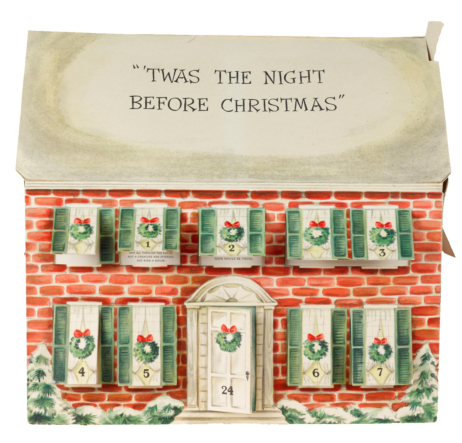
Advent Calendar – main view

Although I generally photograph books and flat documents, I occasionally have the opportunity to photograph three-dimensional objects. Depending on the type of object (this fold-up calendar, cuneiform tablets, a mummified crocodile!), I use different lighting setups and camera techniques. As I photograph these rare objects, I’ve become more and more interested in trying to represent them in as close to three dimensions as possible.

In lieu of a 3-D scanner, I have been experimenting with creating 360˚ rotating views of the objects. Done as sort of a proof-of-concept project, I photographed this Advent calendar, part of our Harris Broadsides Collection, using 360˚ rotating processes.

The process is actually pretty straightforward: you set up your camera and lights (all your settings and positioning must stay the same); and your object must be stable, and centered on a surface that can be rotated in small increments (as close to every 5˚ or every 10˚ as possible). While you can buy these devices, we took a more DIY route and made one using a lazy susan. To ensure that I rotated each shot only 10˚, my coworker generated an Adobe Illustrator file that had each 10˚ marked out exactly. While we have since started using a 5˚ model for better accuracy and more smooth rotations, it worked quite well:

The two different printouts I use when making 360˚ images.
Left: the printout used for this setup, with markings every 10˚, yielding 36 shots;
Right: our newer printout with markings every 5˚, yielding 72 shots.

I then used the Illustrator printout to mark off 10˚ on the lazy susan, centered the calendar on the surface, and began shooting. I lined up a spot on my shooting table which I could line up with each marking, and made my shots. I ended up with 36 images, and removed the background from each one.

Advent-10
The Advent calendar with background, showing its placement on the lazy susan and the 10˚ markings used in capture.
Advent 10-2
The same image, with the entire background masked out using clipping paths (just as in the “Coffee Pots and Clipping Paths” post).

While we can upload the images to the web and create interactive rotation using HTML5 & JavaScript, we can also produce movies that allow for a similar viewing experience. We also hope to work with our repository team to add zoom and angle-of-view functionality. Below is a sample movie:

Sanskrit Friday

November 2, 2012 by | Comments Off on Sanskrit Friday

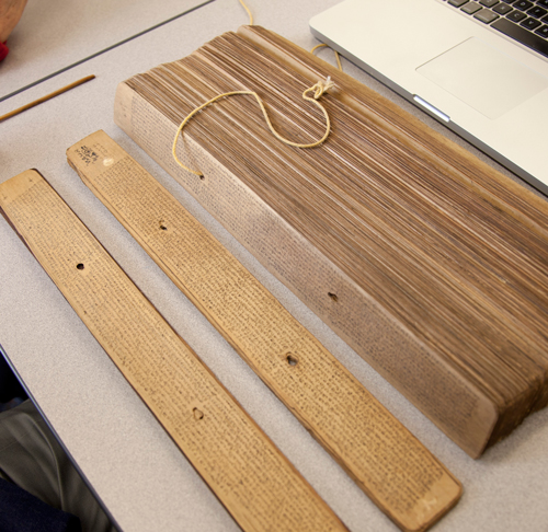
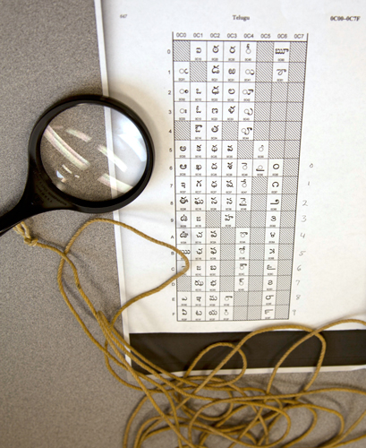
I was lucky today to work with two Sanskrit scholars, Peter Scharf and Susan Moore (both affiliated with the Sanskrit Library), to photograph some missing leaves in our palm leaf manuscripts digitization project. Palm leaf manuscripts are actually just what they sound like: they are manuscripts made from dried palm leaves, onto which scribes would etch the lettering and then apply dry ink, often black soot, over the etched letters. This practice is more than 2,000 years old, although with the need to recopy the leaves due to condition problems, many leaves we see today are much younger. The manuscripts are in sections, and each section is bound together with cord that runs through holes in each leaf. Our visiting scholars helped determine which leaves we needed to photograph (some of the manuscripts are in Sanskrit, some in Telugu), disassembled the manuscripts, and ensured that the leaves remained intact and in order.

Disassembling the manuscript

Reading the numerical system in the manuscript

Here’s an example of a typical palm leaf from these manuscripts (with color targets, which we include for our archival copies):

Some of these manuscripts are centuries old, and bear the marks of their age. The below manuscript shows that the leaf was partially eaten, presumably by a worm:

Another issue we run into with the manuscripts are leaves that have not been inked – when the leaf was etched by the scribe, but ink was never added to the etching. Here’s an example (at 100% magnification) of two separate palm leaves. One has been inked, while the other has only been etched. To be able to capture this properly, I had to tilt one of our lights at a very low angle to the manuscript, so that the raking light would fill the embossed letters and make them legible.

Although challenging, these manuscripts were fun to photograph. Part of what makes this work so interesting is the wide variety of materials we have, and the scholars, curators, and researchers that we get to work with.

Almost as long as the river itself

October 19, 2012 by | Comments Off on Almost as long as the river itself

Recently, I was working on a patron request that involved photographing multiple foldout maps from a range of books. Foldouts in books are always tricky, and involve both conservation and photographic issues.
I like to work with a “First, do no harm” mentality when dealing with fragile materials; if I have any concern that they might be damaged during digitization, I head directly over to our Conservator. In fact, there were two books in this request that I did not photograph, because their foldout maps where either too fragile or too brittle to unfold (I find paper that’s been folded for over a century or so likes to stay folded).

Once I know that I won’t damage the foldout, the next challenge is to photograph it. This means supporting the entire foldout (usually with foam sheets) and making sure it’s as flat as it can safely get. From there it’s a dance of sorts to make sure the entire object is evenly lit (tough when you have creases that create shadows) AND that the entire expanse of the foldout is in focus (especially difficult when it doesn’t unfold completely flat).

We do sometimes run into foldouts that require photographing in multiple steps and stitching the pieces together. In these cases we are very careful to replicate the circumstances of each image exactly (i.e. with lighting and focus), and stitch the image together in Photoshop without changing the object in any way.


This image comes from Chisholm’s All Round Route and Panoramic Guide of the St. Lawrence: the Hudson River; Saratoga; Trenton Falls; Niagara … the White Mountains; Portland; Boston; New York, published in 1874. The book itself is five inches wide by 7.5 inches tall – the map is about 7.25 inches wide and almost 13 feet long. The vertical image on the left shows the length of the map, shot as nine separate images and stitched together very carefully in Photoshop.

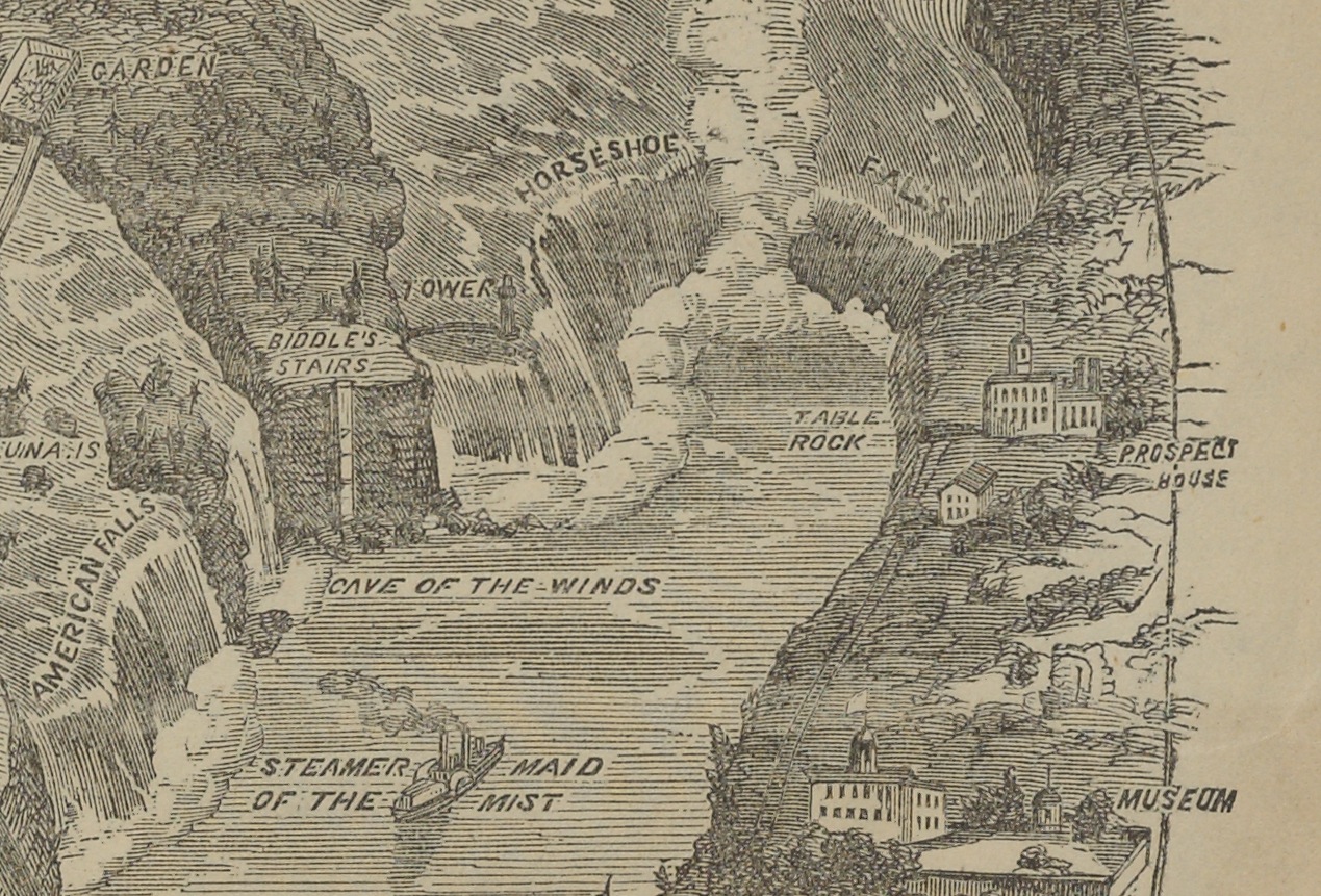
Because the map was actually quite flat, I was able to shoot directly on our reprographic stand. Our camera is very high resolution (80 megapixels), as you can see with this detail shot, taken as a screen shot when the image was enlarged to 100%.

This map happens to be of the Niagara River, so we see Horseshoe Falls and even “The Maid of the Mist.” The entire map is this detailed, and it’s pretty amazing to see such a large map fold out of such a relatively small volume.

The map did photograph easily, but parts of the map had already torn (as visible in the long image, where you see some small breaks in the map). This went straight to Conservation after photography. Also visible are the color targets we include in each shot (I only included six of the nine I used; once for each shot). These ensure that our exposure, color balance and resolution are set properly to ensure an archival file viable for many future uses.