Digital Production Services Homepage Brown University Library Homepage Brown University Homepage

c u r i o

Imaging rare, unusual, and intriguing objects at the Brown University Library

Illuminating Postcards

February 13, 2013 by | 2 Comments

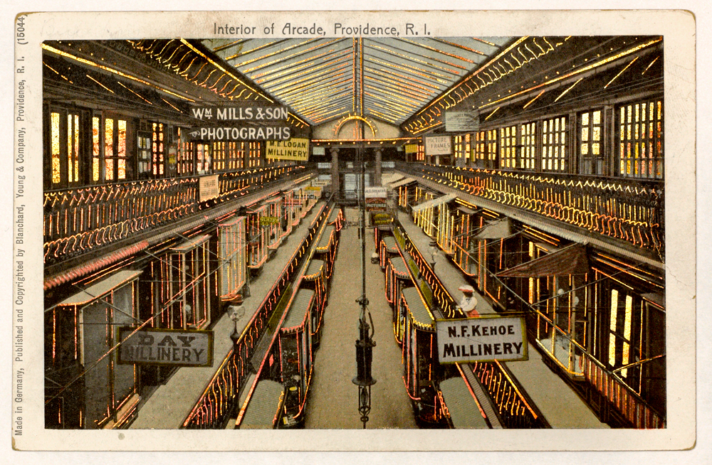
Arcade

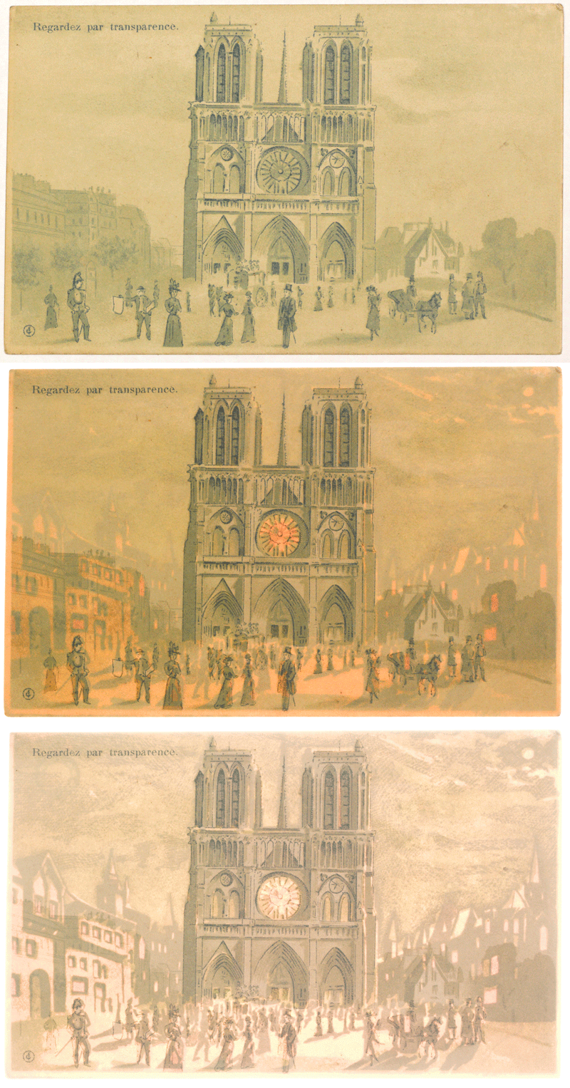
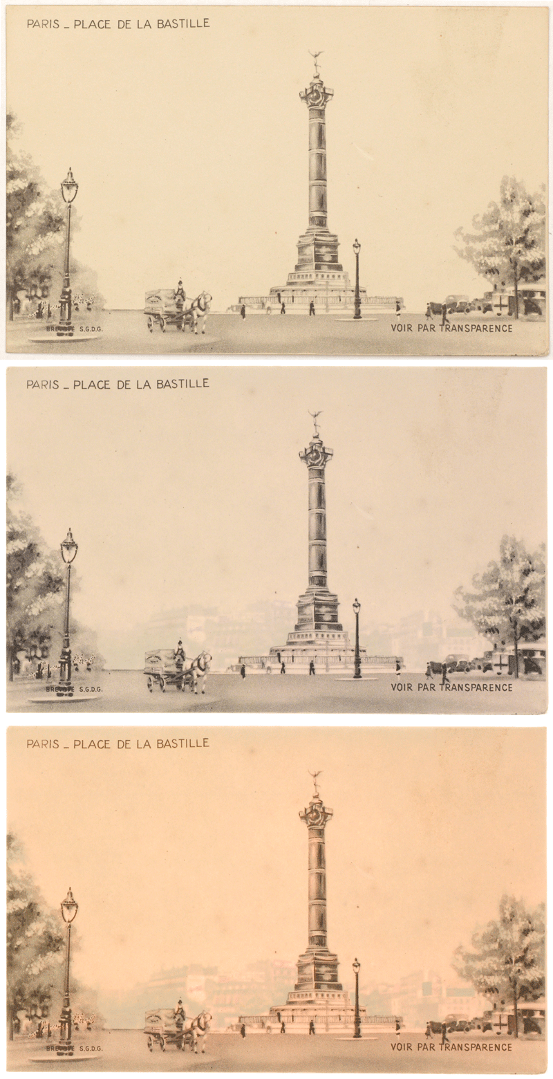
While I generally work with objects and texts from Brown’s Special Collections, I also work with images for the instructional image collection with Karen Bouchard, the Scholarly Resources Librarian for Art and Architecture (she has a Twitter feed for the Brown Imaging Blog). These are images scanned for faculty members (primarily in History of Art and Architecture and Visual Art). For this project, I was digitizing postcards in the personal collection of Brown alumnus Seth Cohen, lent to Professor Dietrich Neumann for use in his lectures. These postcards – representing a range of locations and time periods – look at first like ordinary postcards, but illuminate in specific areas in the card when backlit. Sometimes, the backlighting shines through windows and doors in a bright, copper color; other times, the light brings forth a part of the image unseen when viewing normally.

The following are two animations of illuminated postcards: they start with the postcard lit normally, then move to two different strengths of backlight.

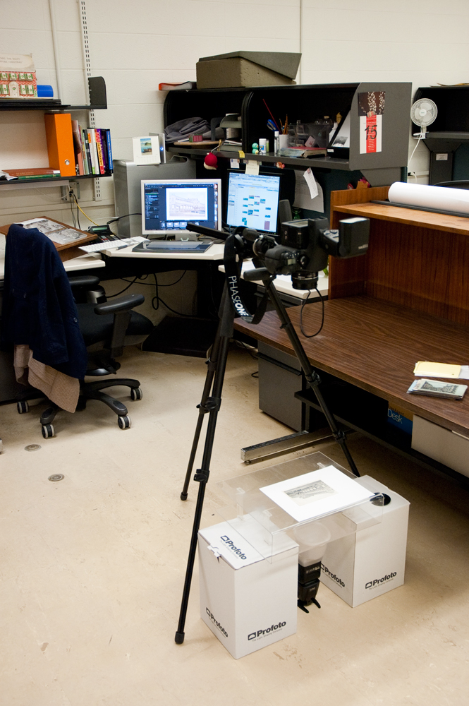
While it’s relatively easy to view one of these postcards – holding them up to a window or to a bright indoor light does the trick – capturing that in a photograph is much more challenging. After some trial and error, I devised a simple system to backlight the postcards with a light strong enough to show the layers of information, while still providing enough ambient light to read the information on the front of the card. I set up our Leaf Aptus II-12 digital back on its medium format camera, attached it to a tripod set to shoot straight down, and did tethered capturing into Capture One (the software we use to capture using our Leaf digital back). I used two Canon 580EXII flash units; one mounted on the hot shoe of the camera, and one functioning as a synched flash on the floor with a Gary Fong Lightsphere diffuser. I used an acrylic box to lay the postcards on, and put that on some boxes so that there would be some room between the flash on the floor and the postcards. I bounced the flash on the camera off the ceiling, so that it would provide a diffused ambient light that would neither overpower the postcards, nor cancel out the backlighting.
Interior Designs

January 4, 2013 by | 1 Comment

Much of the work that we do here at DPS involves objects and items from the Brown Library’s Special Collections. These are housed in the John Hay Library, which just recently celebrated its Centennial. It is a gorgeous building, and many of the simple, white wooden doors belie the beautifully curated spaces beyond.

The Bruhn Memorial Reading Room is one such room. When I was asked for photograph it for Brown’s new version of the History & Guide to Special Collections, I had never actually been in the room before. Home to part of the Special Collections, and featuring warm wood paneling and tall windows that overlook Prospect Street, the Bruhn Room is used for a variety of purposes within the library, from classes and private study, to candidate presentations and meetings, to videotaped interviews with students and visiting scholars.

It’s a beautiful space, to be certain, but it’s difficult to capture all of this photographically. To capture all the elements of the room; from the paneling and windows, to the many books, objects, furniture and chandelier, I had to make many exposures that I could use to blend together to create one single, merged image. I shot a great many images, varying both the exposures (to pick up the detailing under the tables, in the bookcases, and on the ceiling), and the white balance (to correct for the overhead lights as well as the window light from outside). Although I did use a specialized lens (a 24mm tilt-shift lens, like the one in this video) to correct for perspective issues, I also had to make a final perspective correction as well.

The final image came out very strong, and ended up being published in The Manuscript Society News (vol 31, no. 4). Below you will see the progression of images as I compiled the final image, building up exposures and color balance. n.b.: You can click on any image to make it larger, and then click through the images to view one at a time.

Image 1: Overexposure to capture shadow detail under table, in bookcases.

Image 2: A darker exposure to bring out the richness in the wood paneling, floors and walls.


Image 3: A MUCH darker exposure, to bring out the details in the ceiling, washed out in the previous exposures.

Image 4: Image correction in Photoshop to correct the ceiling color and luminance but preserve the detail of the chandelier.


Image 5: An additional, darker layer, to bring in ONLY the detail of the overexposed window.

Image 6: An exposure the same as Image 5, but set to daylight white balance to correct the blue tone.


Image 7: A slight darkening on the ceiling, along the strips of light that outline the arch.

Image 8: A minor contrast adjustment on the same strip of ceiling, to show the detailing and sculptural quality of the ceiling.

The final image, with perspective adjustments to compensate for shooting at a wide angle in an enclosed interior space.

From Caesar Monuments to Movie Posters

November 15, 2012 by | Comments Off on From Caesar Monuments to Movie Posters

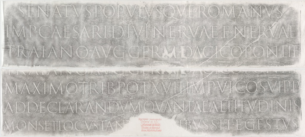
In 2007, the Library digitized two original, loaned rubbings of the inscription from Trajan’s Column (c. AD 113), to facilitate a reproduction request of the Rare Book School’s then Program Director Ryan L. Roth. The rubbings had been made by Edward Catich in 1970, and are now owned by Sheila Waters. Because of their size (two ~9-foot-wide thin-paper sheets), these were digitized in three overlapping shots per sheet, atop a white background, and then digitally merged together to create the final images.

Catich’s rubbing of Trajan’s Column’s inscription.

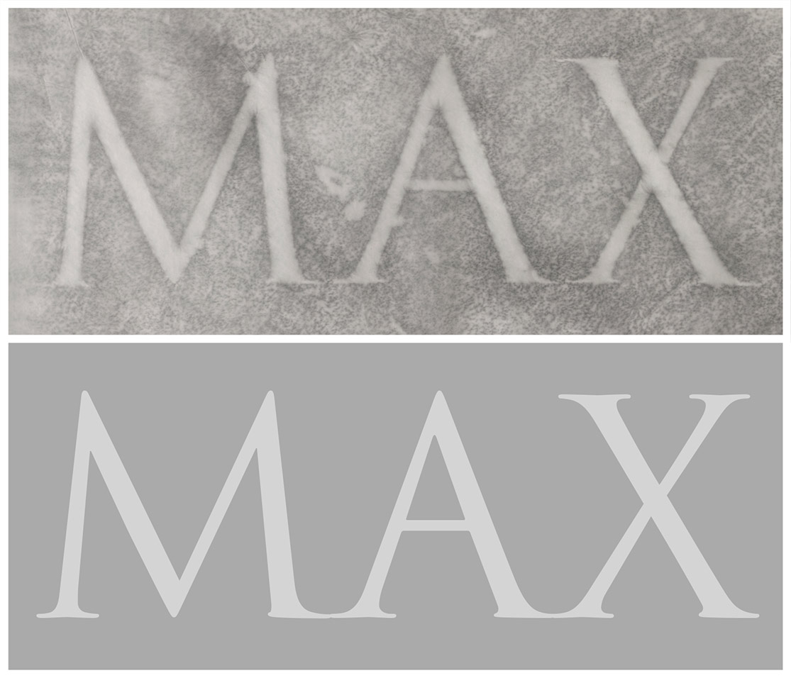
Catich’s research and speculation on Trajan’s Column’s lettering in turn influenced the creation of the now-popular digital font Trajan, first released as a PostScript font in 1989 (designed by Carol Twombly for Adobe Systems).

Top row: detail from Catich’s rubbing; bottom row: matching letters from the digital typeface.

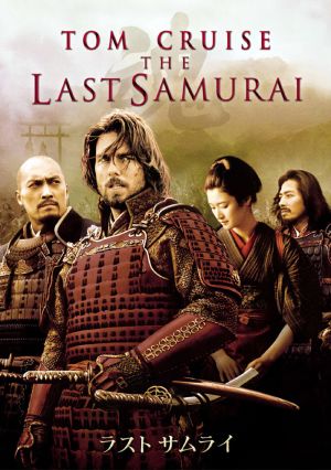
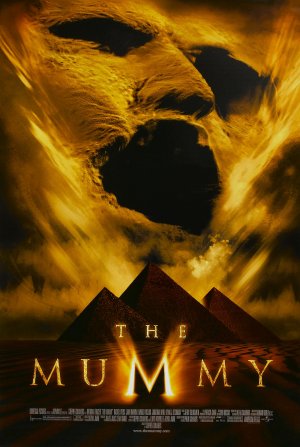
Ever since, starting in the early 1990s, and often as an affront to many graphic designers’ sensibilities, the Trajan font has been featured on an inordinately high percentage of American movie posters — even to the extent that the Roman lettering style is now associated with both Japanese Samurais and Egyptian mummies.

Trajan in The Last Samurai

Trajan in The Mummy

Sanskrit Friday

November 2, 2012 by | Comments Off on Sanskrit Friday

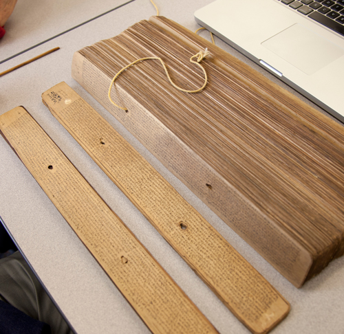
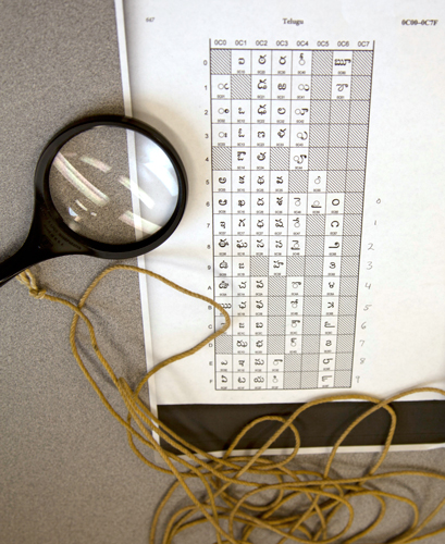
I was lucky today to work with two Sanskrit scholars, Peter Scharf and Susan Moore (both affiliated with the Sanskrit Library), to photograph some missing leaves in our palm leaf manuscripts digitization project. Palm leaf manuscripts are actually just what they sound like: they are manuscripts made from dried palm leaves, onto which scribes would etch the lettering and then apply dry ink, often black soot, over the etched letters. This practice is more than 2,000 years old, although with the need to recopy the leaves due to condition problems, many leaves we see today are much younger. The manuscripts are in sections, and each section is bound together with cord that runs through holes in each leaf. Our visiting scholars helped determine which leaves we needed to photograph (some of the manuscripts are in Sanskrit, some in Telugu), disassembled the manuscripts, and ensured that the leaves remained intact and in order.

Disassembling the manuscript

Reading the numerical system in the manuscript

Here’s an example of a typical palm leaf from these manuscripts (with color targets, which we include for our archival copies):

Some of these manuscripts are centuries old, and bear the marks of their age. The below manuscript shows that the leaf was partially eaten, presumably by a worm:

Another issue we run into with the manuscripts are leaves that have not been inked – when the leaf was etched by the scribe, but ink was never added to the etching. Here’s an example (at 100% magnification) of two separate palm leaves. One has been inked, while the other has only been etched. To be able to capture this properly, I had to tilt one of our lights at a very low angle to the manuscript, so that the raking light would fill the embossed letters and make them legible.

Although challenging, these manuscripts were fun to photograph. Part of what makes this work so interesting is the wide variety of materials we have, and the scholars, curators, and researchers that we get to work with.

Coffee Pots and Clipping Paths

October 25, 2012 by | Comments Off on Coffee Pots and Clipping Paths

In addition to photographing Special Collections materials for ongoing digital projects, or for patron requests for publication, Digital Production Services also digitizes items to be featured in library-produced promotional publications. In 2008, a coffee pot once owned by “Dr. Bob” (Rober Holbrook Smith), a founder of Alcoholics Anonymous, was taken off the shelf and set against a simple white background to be photographed.

The photograph itself is a straightforward shot — at the time, captured using the John Hay Library’s Nikon Digital SLR camera. However, to remove the background for a publication layout, “clipping paths” were created in Adobe Photoshop. Clipping paths are a useful way to mask-out the background within a scene — in other words, clipping paths can be used to visually define the edge of an irregularly-shaped object which does not conform to a standard rectangle-based crop.


Above, L–R: detail of coffee pot digital image; detail of image with background removed via pixel-based selection; detail of image showing vector-based clipping path overlaying pixel grid; clipping-path-masked image as placed in final layout.

There are pixel-based methods of creating masks in Photoshop, although clipping paths offer a unique solution, storing resolution-independent Bézier-curved (vector-based) edges alongside the pixel-based image grid, particularly useful for layered layout designs. Curves used for clipping paths are the same vector-based curves now becoming more widely supported by web browsers, as part of the Scalable Vector Graphics (SVG) specification and HTML5’s <canvas> tag scripting. (For an example of resolution-independent, vector-based curves implemented solely via web-based technologies, see this proof-of-concept site by a Google employee.)

Almost as long as the river itself

October 19, 2012 by | Comments Off on Almost as long as the river itself

Recently, I was working on a patron request that involved photographing multiple foldout maps from a range of books. Foldouts in books are always tricky, and involve both conservation and photographic issues.
I like to work with a “First, do no harm” mentality when dealing with fragile materials; if I have any concern that they might be damaged during digitization, I head directly over to our Conservator. In fact, there were two books in this request that I did not photograph, because their foldout maps where either too fragile or too brittle to unfold (I find paper that’s been folded for over a century or so likes to stay folded).

Once I know that I won’t damage the foldout, the next challenge is to photograph it. This means supporting the entire foldout (usually with foam sheets) and making sure it’s as flat as it can safely get. From there it’s a dance of sorts to make sure the entire object is evenly lit (tough when you have creases that create shadows) AND that the entire expanse of the foldout is in focus (especially difficult when it doesn’t unfold completely flat).

We do sometimes run into foldouts that require photographing in multiple steps and stitching the pieces together. In these cases we are very careful to replicate the circumstances of each image exactly (i.e. with lighting and focus), and stitch the image together in Photoshop without changing the object in any way.


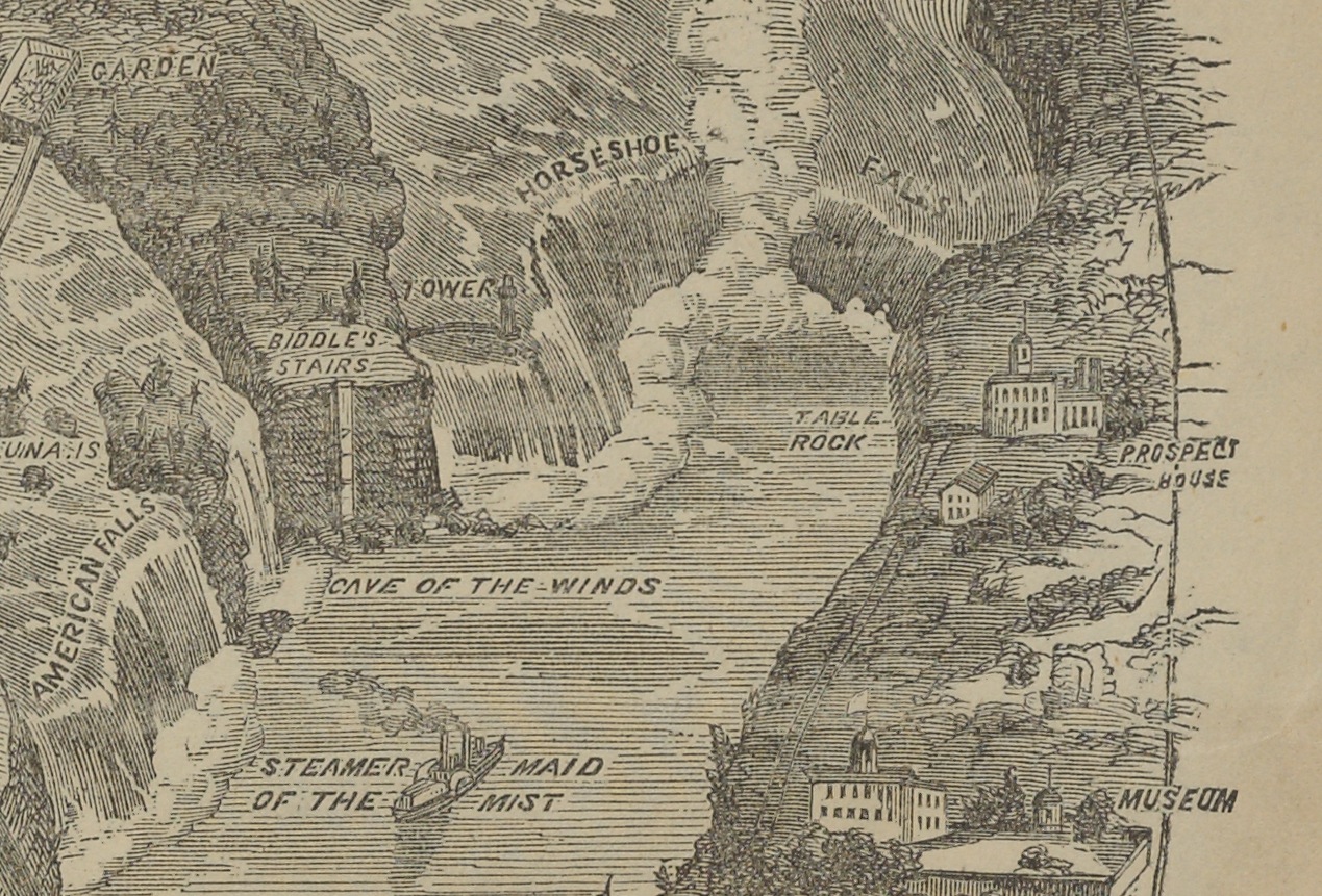
This image comes from Chisholm’s All Round Route and Panoramic Guide of the St. Lawrence: the Hudson River; Saratoga; Trenton Falls; Niagara … the White Mountains; Portland; Boston; New York, published in 1874. The book itself is five inches wide by 7.5 inches tall – the map is about 7.25 inches wide and almost 13 feet long. The vertical image on the left shows the length of the map, shot as nine separate images and stitched together very carefully in Photoshop.

Because the map was actually quite flat, I was able to shoot directly on our reprographic stand. Our camera is very high resolution (80 megapixels), as you can see with this detail shot, taken as a screen shot when the image was enlarged to 100%.

This map happens to be of the Niagara River, so we see Horseshoe Falls and even “The Maid of the Mist.” The entire map is this detailed, and it’s pretty amazing to see such a large map fold out of such a relatively small volume.

The map did photograph easily, but parts of the map had already torn (as visible in the long image, where you see some small breaks in the map). This went straight to Conservation after photography. Also visible are the color targets we include in each shot (I only included six of the nine I used; once for each shot). These ensure that our exposure, color balance and resolution are set properly to ensure an archival file viable for many future uses.


Setting up shop in the Lincoln room!

September 17, 2012 by | Comments Off on Setting up shop in the Lincoln room!

While many of the items we photograph are done in our studio, we do occasionally need to photograph items or objects where they reside at Brown. This is usually due to their size or other constraints that makes moving them too difficult. It then gives us the challenge to both light the object as well as safely maneuver ourselves and our equipment in a variety of spaces.

Baumgras-Lincoln

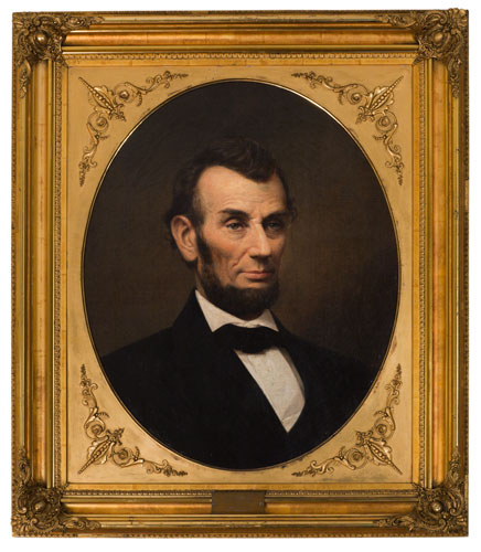
This is exactly what happened when I photographed this portrait of Abraham Lincoln by Peter Baumgras. Part of the Charles Woodberry McLellan Collection of Lincolniana at Brown, the portrait is housed in the Lincoln room at the John Hay Library. Beautifully framed, it’s a lovely portrait to shoot.

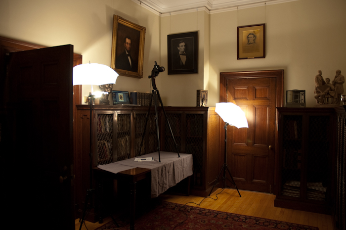
But it’s hung very high on the wall, at a significant angle, without a lot of space to photograph it without distortion. In came our portable lighting setup, our D-SLR (Canon 5D Mark II with 85mm f1.2 L series lens) and tripod, and Macbook Pro (for shooting tethered into Adobe Lightroom).

Lincoln room 1


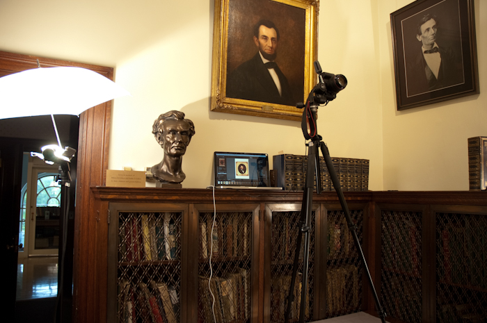
While the painting itself is opposite the camera (naturally), you get a good idea of my setup here — you also get a pretty good idea regarding why this is referred to as the “Lincoln room.” Due to the height at which the portrait is hung, I had to actually put my tripod up on a table next to the bookcases. I have two hot lights (tungsten-based) with shoot-through umbrellas, which allowed me to light the entire space without lighting the painting too directly. (The painting has glossy oil paint and a highly reflective frame, so keeping reflections to a minimum was essential.)

Lincoln room 2A closer shot of the setup shows the camera at an angle. This is not just because the painting is so high – yes, it’s way too high to shoot straight on with the camera, but it also leans forward off the wall by a few inches. It’s not a steep pitch, but enough that it’s easy to get an image that’s just not quite square (i.e. unacceptable).

You can also easily see here that I have the camera hooked up to a laptop for tethered shooting. This allowed me to check the focus, the angle of the camera, the white balance and the exposure all while shooting so I knew I had a usable shot before I packed everything up.

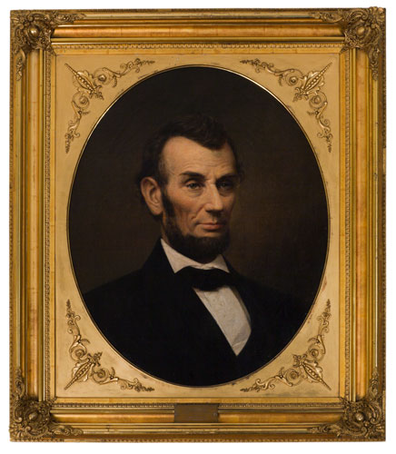
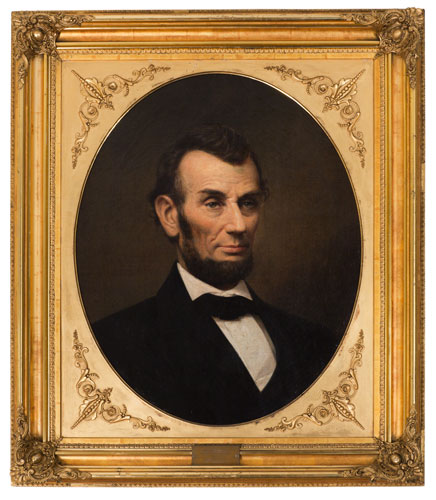
What you can’t see as easily in this shot is that I had to bracket, and ended up using two different exposures, combined into one, for the final image. I used one darker exposure for the bright frame, and a lighter exposure for the portrait itself, which has subtly textured shadows that I wanted to show. In Photoshop, I carefully made a path around the actual painting, and masked out the darker frame. Layered atop the brighter frame, we get the final image, which exposes correctly for both elements of the object.

Lincoln-before Lincoln Bright

1. Dark image, exposed correctly for the frame. 2. Light image, exposed correctly for the painting. 3. Detail of layered image, showing detailing in the frame and the painting.