Digital Production Services Homepage Brown University Library Homepage Brown University Homepage

c u r i o

Imaging rare, unusual, and intriguing objects at the Brown University Library

Digitizing the “mirror with a memory”

October 7, 2014 by | Comments Off on Digitizing the “mirror with a memory”

As we celebrate Brown’s 250th anniversary, Digital Production Services has been asked to digitize many historical university materials. Some of the earliest photographs in the university’s extensive collection are daguerreotypes made of graduating classes, and I was recently asked to digitize two these: the class of 1847; and the class of 1852.

iphone-reflection

The common reflective characteristics of a daguerreotype.

Daguerreotypes present several challenges in digitization, mainly due to their inherent physical characteristics. Above all else, daguerreotypes are by their very nature incredibly reflective. In this nineteenth century process, the actual photographic image is formed on a silver-coated copper plate that is polished to a mirror-like sheen. Depending on the lighting and viewing angle, even just hand-holding the daguerreotype may provide you with a clear image of the subject, or you may just be staring back at yourself. Additionally, daguerreotypes are often encased behind glass to protect the fragile image resting on the surface of the silver – helpful in maintaining image integrity, but adding another layer of reflection. In order to view the daguerreotypes (as well as digitize them) with any degree of success, you must control the lighting that strikes the object, and completely block out any object that would cause a reflection. Because lighter objects are always more visible in this type of reflective image, photographing a daguerreotype of any size requires surrounding the object with black foam, paper, or cloth that will help offset its reflective properties.

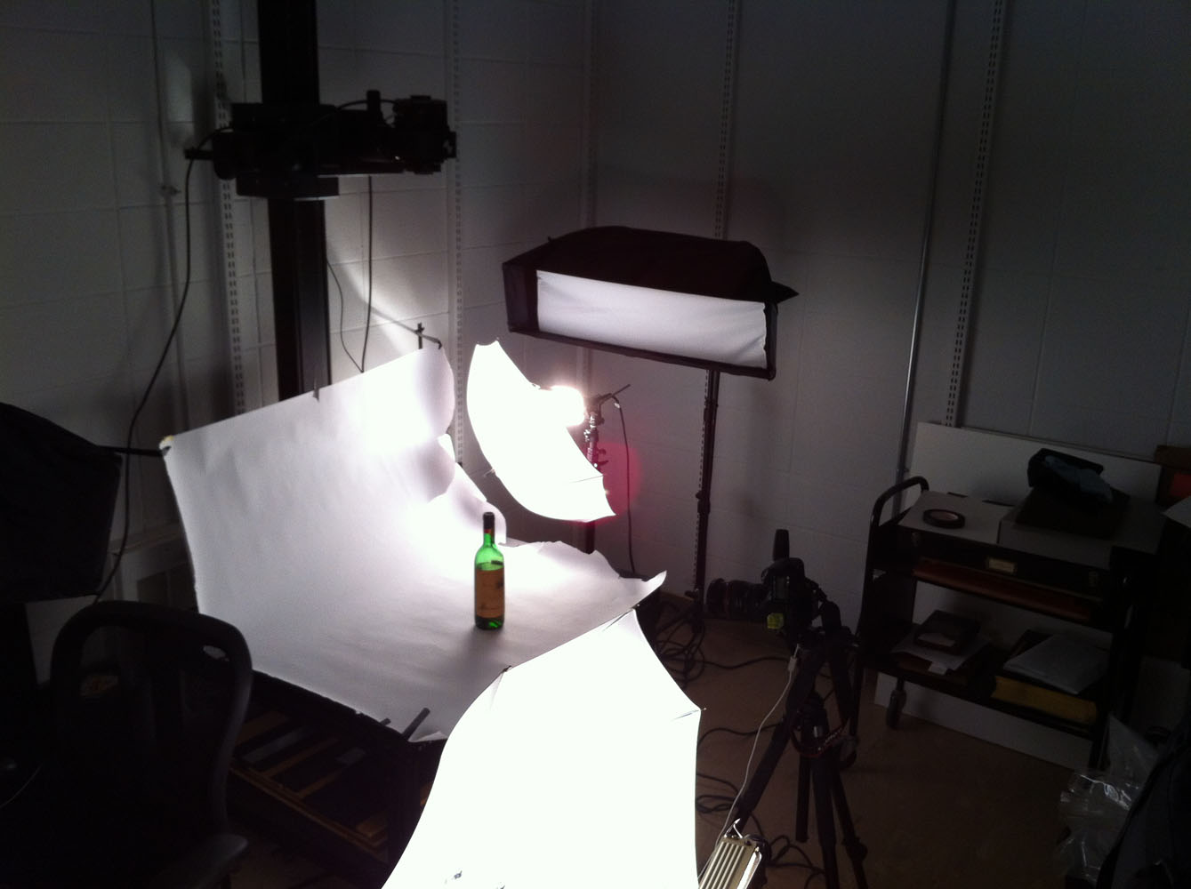
I approached photographing these daguerreotypes the same way I would approach any reflective material: by building what amounts to a tent around the object. Whereas with many objects (highly reflective silver with no printing, for instance) work best surrounded by white paper or foam core (or even semi-translucent vellum), daguerreotypes work best surrounded by all black. Black eliminates reflections, as well as helps make the image on the surface of the silver as clear and readable as possible. The most obvious reflection is often that or the camera itself; since I was photographing the daguerreotype reprographically, the camera was positioned directly above that polished silver surface. The best way to avoid seeing the camera’s reflection in the lens is to take a large sheet of black foam core, cut a small hole just for the lens of the camera, and cover the entire camera rig with the foam core.

reflection-comparison

Daguerreotype, Brown University, class of 1852: The image on the left shows the camera (with its various wires to the computer and strobes) directly reflected in the daguerreotype; the image on the right shows the same daguerreotype with the camera covered by black foam core.


Although it’s possible to just use a sheet of black foam core to reduce reflection, I built a small rig to hold the foam core up (hand holding it myself could potentially add camera shake) and reduce any reflections from the walls behind the camera (painted a light neutral grey, but still reflective). These photographs show the supports for the foam core and the hole I made for the lens, and then the final setup for shooting.

behind-the-scenes

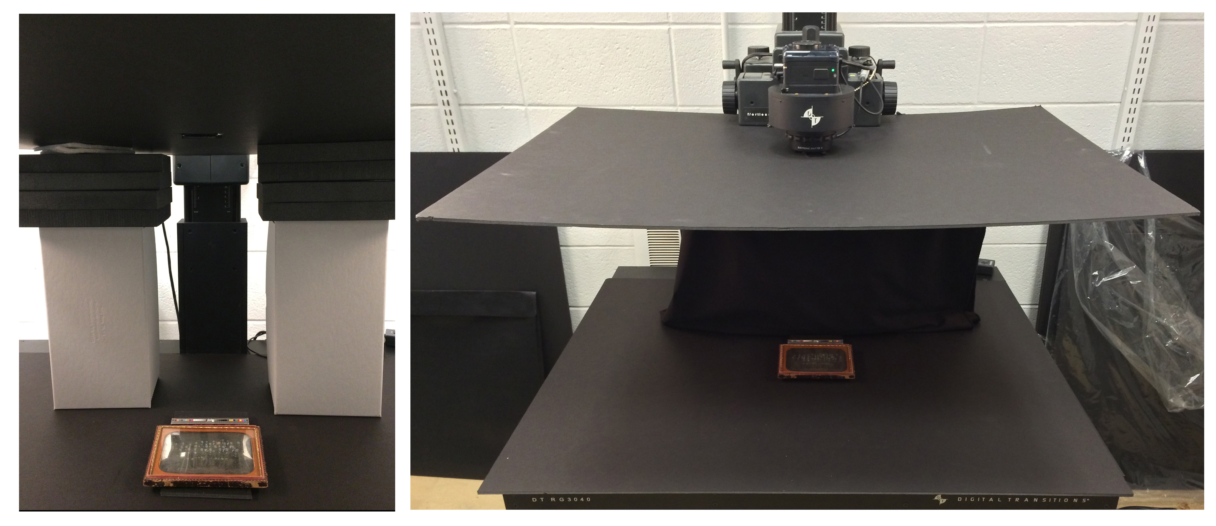
Additionally, although proper focus is always important, it is particularly important when it comes to daguerreotypes. Daguerreotypes were developed in 1839, and these older processes required much longer exposure times than what we are used to: a typical exposure could last up to a minute or more. Because of this, at the time it was challenging to keep people in focus because it was difficult to keep them still; as a result, it can be tricky to make out faces due to the motion blur. Thus, when digitizing, keeping the focus as sharp as possibly is necessary to producing a readable image. For this daguerreotype, I actually placed the object on several blocks of foam core to focus into the encasement and reach the image on the plate beneath.

Finally, both daguerreotypes are suffering from degradation and corrosion, common problems for this sensitive and fragile type of photograph. They will soon be sent to the Northeast Document Conservation Center for conservation and repair.

Streamlining Broadsides

September 5, 2014 by | Comments Off on Streamlining Broadsides

Over the past year, Digital Production Services has been working on the digitization of one of the Brown University Library’s extensive collections of broadsides.  The Rider Broadsides Collection (named for Sidney S. Rider, the Providence bookseller, publisher, and antiquarian from whom the collection was purchased and then subsequently donated to the university) is the largest privately owned collection of materials related to history of Rhode Island. It’s been a great opportunity to see firsthand such historic materials, and the broadsides themselves have been largely straightforward to digitize.

Just one of many historical documents that DPS has digitized as part of the Rider Broadsides collection.

And the ability to digitize these materials efficiently is important when undertaking such a large project; were the materials all fragile, oversize books with foldouts, digitization could easily take years. But the Rider Broadsides have two important qualities that allow for high quality and high speed digitization: they are mostly flat materials, and many of the broadsides are approximately the same size. Books, for instance, with most setups require constant focus adjustments since the distance from the camera to the page changes as one moves through the books. Likewise, materials with size differences require the camera to be raised or lowered (and then refocused) to accommodate these variations and provide the best quality image. The Rider Broadsides, though, allowed us to set the camera height and focus at the beginning of a session, and then digitize a full day’s worth of work without requiring substantive changes in our setup (spot checks for focus and exposure are always made).

However, once the regular size materials had all been digitized, we moved onto the oversize materials, which present more of a challenge. There are just shy of 400 1-Size broadsides, which vary in size from 12″ x 16 ” to 18″ x 24″ (give or take 1/4″). While this may not seem like such a wide range, going from the smaller size to the larger requires us to either reset everything for each shot (including special compensation for vignetting on the larger materials), or to shoot everything as if it were the largest size. The problem with shooting for the largest size object is that we’d be compromising resolution: as the camera moves further from the object, resolution decreases. We had shot all the regular materials at 600 ppi (at full size), so one of our goals is to maintain as much resolution as possible. So we had to devise an approach to digitizing these materials that would maintain the efficiency as well as the quality that we had achieved with the regular-sized broadsides.

IMG_1047

Each of the four groups of broadsides, separated and labeled by size and camera settings.

The answer was to separate out the broadsides by size, and create a specific and easy-to-replicate camera setup for each size range. After going through every broadside, I came up with four size categories: 12 x 16, 14 x 19, 16 x 21, and 18 x 24 (all in inches). All the broadsides fit into one of these size ranges, which allow us to maximize resolution for each size. With a fixed set of size ranges, I went about determining the camera setups. Using just a tape measure and camera target, I plotted where on the camera platform a specific size would fall. I them focused the camera on the target, to see precisely where the camera needed to be to cover the entire image area while in focus. I noted the maximum size of an object for that image area, the resolution that could be achieved, and the height that the camera required (this number is taken from the mounted rail on the camera platform). I made labels for each set of broadsides, which I had separated onto different book trucks.

I also made tape labels for each size range that I affixed to the camera rail. This way, regardless of the person working in the camera room that day, and regardless of which group of broadsides they were working on, all the photographer needs to do is check the label on the stack of broadsides to determine the image size, find the corresponding label on the camera rail, move the camera to level with the label, focus, and shoot. We have digitized hundreds of broadsides so far, and this has turned out to be useful not just for effective digitization, but also for easier retrieval of paged materials.

signs2

Details of signage and camera rail markings.

A more typical look at the camera room

July 11, 2014 by | Comments Off on A more typical look at the camera room

Since I often concentrate on more involved or difficult setups, I thought it might be good to take a look at a setup that we are most likely to encounter at DPS on a day-to-day basis. This image shows an album of watercolors depicting the uniforms of European soldiers from 1791-1808, and represents just one of the over 25,000 digitized objects from the Prints, Drawings and Watercolors from the Anne S.K. Brown Military Collection, one of the foremost American collections of material devoted to the history and iconography of soldiers and soldiering. This is our basic reprographic setup: our digital back is mounted on a specialized lens; and two softboxes (only one pictured) are positioned at the same angle to, and equidistant from, the shooting platform.

cr-01

We have multiple ways that we can approach digitizing a bound volume. Depending on its size and condition, we have different book cradles that we can use to either provide non-invasive, gentle support to a fragile book, or to lightly press open and flatten the pages of more robust, tightly-bound items. Because this book was relatively small, and bound very loosely, I chose to simply lay it flat on the platform (which is covered in 1/2″ thick foam core) and use a foam wedge to support the opposite side of the book. To keep the foam in place, I used a covered brick placed directly behind the foam. Here, the image (from the reprographic camera’s point of view) shows that I’m photographing the back of an illustration; we generally photograph both the front and back of all our materials.

cr-02

We also make sure to include a target in each image. You’ll notice I’m using a medium-sized target made by Image Science Associates here, sitting atop a thin wood block. It’s important to keep the target in focus as I move through the book, which means that the target must be the same distance from the camera as the page that I am photographing. We use a variety of tools to make sure the target and page are the same distance from the camera – foam, wood blocks, etc., – and you can see my extra, smaller target as well as additional blocks I have at the ready as I move through the pages of the book.

I should note that while this is a more typical setup, each object presents its own set of requirements to both care for the actual item but also produce the best quality, most viable digital image possible. Some are certainly more straightforward than others, and some come with surprises like folds that won’t settle or rippling pages. Our setup will start basically the same (support the object, correct focus and lighting) and then we move, with adjustments here and there, to the final product.


Avoiding Moiré

March 25, 2014 by | 1 Comment

Because we photograph a great deal of prints and engravings, moiré patterning is an issue that we must consistently keep an eye out for. Moiré patterning often occurs during image capture; it can also happen if you’re viewing an image at a certain magnification, but this is easily addressed by changing the magnification. It’s when moiré patterning enters during image capture that you must address it immediately, since it’s difficult to remove without creating more image artifacts.

Moiré patterning happens when your subject has some type of regular pattern – in our case, this is usually regular lines in an engraving, but can also happen when photographing textures on paper or cloth that have a regular weave to them. When the regular pattern of the subject overlaps with the regular pattern of the image sensor, the moiré patterning is born. It’s usually seen as bands of color, or light and dark.

moire-problems

The two images above are examples of both kinds of moiré patterning. The image on the left, with the black-and-white pattern, happened due to image magnification. This image itself was fine, but viewing it at this magnification was problematic. The image on the right, however, shows moiré patterning that happened during the capture process. You can clearly see the bands of color that, rather than being a function of viewing the image, are actually present in the image itself.

Correcting the viewing problem is a non-issue; one must simply view the image on a different monitor or at a different magnification. Correcting the patterning that happens during capture is actually almost as simple: it’s all about the orientation of the original. Because moiré patterning is a function of the relationship between overlapping patterns, all we have to do to correct this is change that relationship; put another way, we have to change the alignment of the patterns. For this object (from our Rider Broadsides collection), I had been photographing all objects in the collection aligned as relatively straight verticals to the sensor. To correct the alignment, I simply tilted the image so it was crooked in the capture (it’s important that this isn’t a 90˚ tilt, but a more arbitrary tilt). This corrected the problem immediately. Below is the final image, as well as a detail of the most problematic area of the object.

moire-okay

Photographing the Break Up of Time

January 16, 2014 by | Comments Off on Photographing the Break Up of Time

While the vast majority of my work involves photographing items in collection, it may also have become clear in my blog posts that I’m occasionally asked to document library events and library spaces. All of Brown’s libraries have some incredible spaces – for research, for teaching, for collaboration, and for study – and Brown has been diligent in their efforts to maintain their libraries as 21st-century learning environments. As a result, I often have the opportunity to document the renovation of these spaces, as well as the items in Brown’s collections that are on view in the libraries.

Sculpture-main
This past October, Brown alumna and generous Brown University Library supporter Elizabeth Z. Chace (’59, PHB ’96 hon., GP ’13, GP ’15) donated Break Up of Time, 2006, by John Okulick. The approximately 6′ x 6′ aluminum, resin, and wood sculpture was installed in our Sciences Library, in a bustling open landing right behind the main entrance.

Sculpture-birdseye

The challenging part about photographing the sculpture is its location; it’s great for visibility, but it’s tough to get a nice, straight-on shot of it. The sculpture is also lit by three light sources – overhead fluorescent, tungsten light underneath, and window side lighting. Because it’s a fairly high-polish metal, the sculpture is highly reflective and picks up the colors of the light and walls reflecting off of it.

Using my tilt-shift lens, I was able to get a straight-on shot without actually having to be directly in front of the piece. I bracketed for exposure and white balance to get a clean image (when layered in Photoshop). I also took some images that show a little more of the environment around the sculpture, again trying to avoid as much glare, color cast issues, and unnatural skewing of the object as possible.

This image (left) gives a view from the entrance to the staircase, where most people encounter the sculpture for the first time.


How do you solve a problem like a foldout?

December 13, 2013 by | 5 Comments

When assessing how to photograph a book, we must first make several determinations. The key to photographing books well  – by which I mean providing well-lit images, in good focus, without damaging the book or its pages –  is to provide as much support as possible to both the book itself (especially the spine) as well as to each individual page. Evaluating the needs of a book requires that we look at the following criteria:

  • Size of book
  • Condition of book and its pages
  • Characteristics of leaves (plates, text, foldouts or tipped-in pages)

Smaller books in good condition are photographed on a glass cradle that allows us to hold the book open for optimal photography, but supports the spine and keeps the book in good condition. Larger or more fragile books are shot on a wooden cradle, which supports the book and its spine without putting any pressure on the pages. This requires additional work to get each page flat; some curvature is acceptable, but too much creates focus problems so we often add foam supports under parts of a page to keep it even.

This is a page with a small, minor foldout. Set in the wooden cradle, you can see the book as it’s shot, the nook that the book and page fit into with full support beneath them, and finally, the wood and foam supports that made it all possible.

niche

Then we have books that hit the challenging-to-shoot trifecta: they are oversize, have some element of fragility to them, and the plates involve spreads or foldouts that require even more supports and careful handling (and a sharp eye on even lighting and focus). I spent the past couple of weeks photographing just such a book: an oversize book of engravings that is in generally good condition, but whose spine required a bit of extra support. Luckily, each individual page was thick and in good condition, and the sharp, meticulous engravings made it easy to confirm focus. The majority of the book involved one-page plates, some two-pages spreads, and a handful of foldouts.

One of the foldouts was very large: 20″ x 46″ in total. In order to have decent lighting and any sort of viable resolution, the foldout had to be shot in sections, to be stitched together afterwards. Each section needed to be centered on the platform, at the same distance away from the camera and with no changes to the lighting or focus. The real challenge was to meet these requirements while supporting the book and each section of the foldout. After meeting with our Materials Conservator (the first step in any kind of endeavor like this), she gave me a great plan to make this happen: after the first shot (the part closest to the spine), I set up the book cradle on a book truck, slowly moved it backward to allow the foldout to unfold, and photographed each flat section. As the page opened up and was no longer supported by the pages beneath it, I used Foamcore to keep a level, stable support for the foldout. I also leaned the unfolded parts of the pages against a foam support and kept it in place with a lead rope, to ensure the paper remained intact. Below are the step by step shots (save the final one, which required me to hold some of the foldout closed while taking the photograph with the foot pedal).

IMG_0936

Foldout, Section II & III

IMG_0929

Foldout, Section I


IMG_0950-main

Foldout, Section IV (including book truck and foam core supports)

And then we have the final, fully stitched foldout. I did keep a reference shot with the color target, just to be safe.

folded

No tannins at all, and very little fruit (part I)

September 6, 2013 by | Comments Off on No tannins at all, and very little fruit (part I)

wine-in-place

Perelman Papers, Box 11

Such was the assessment of a leaking bottle of wine from the manuscripts collection (by a library staff member who dared to take a sip). There’s more to this story, and I was lucky enough to be able to both participate in and document the first few chapters.

As preparations began for the 14-month closure of the John Hay Library (Brown’s Special Collections Library), workers readying items for transport to offsite storage noticed that a box in the S.J. Perelman Papers (part of the Archives) was leaking. Inside was a bottle of wine, which had been safely housed in the Hay’s vault for decades; at some point, however, the cork had become unstable and had begun to leak wine. It was clear that the bottle would have to be emptied and sent to our materials conservator. Before (fully) breaking the seal and removing the wine, the bottle was brought to me so that I could document it in its unaltered state. While the most crucial part of this process was to capture and preserve the hand-drawn label, we also wanted to have a record of the object in its original state.

Wine-19

Wine bottle at the ready, I set up our reprographic camera stand to use as a shooting table. Because our strobes have narrow softboxes on them (perfect for documents and books, not so perfect for three-dimensional objects), I used our portable hotlights with umbrellas. Photographing glass is tricky; it’s best to light it from behind, using bounced light to give the object its shape and prevent distracting reflections. However, in this case I needed to show the glass, the liquid inside, as well as the label on the front. I used one light to illuminate the scene, with particular attention paid to the label. I used the other light as a handheld light; I held it by the light stand, and used a variety of angles and distances from the bottle to get the lighting I wanted.

In the interest of thoroughness, I photographed the bottle from the front, back, and sides. The most difficult shot was the back of the bottle, as the label prevented me from lighting through the bottle, and made the surface of the glass highly reflective. I could get myself out of the frame, but both the camera I was using and the one mounted to the top of the repro stand were visible in the glass. I taped white paper over the top camera, which solved the problem easily. The camera directly in front of the bottle needed a bit more work. Using the lens cap, I traced a circle onto a piece of paper. I then cut that circle out, and mounted the paper on the camera (using the lens cap gives you a good approximation of the lens size). The resulting image has the expected specular highlights and reflections, but has minimized the obvious camera/room reflections.

Wine-tent

Making the camera cover to reduce reflections.

The final images give a good sense of the bottle, the wine inside, and the label. To afford users a full view of the label, I combined three different shots of the bottle into one.

Front, back, and label views.

Front, back, and label views.

Next time, we’ll look at how we approached uncorking the bottle – and what its contents had in store for us.