Digital Production Services Homepage Brown University Library Homepage Brown University Homepage

c u r i o

Imaging rare, unusual, and intriguing objects at the Brown University Library

Avoiding Moiré

March 25, 2014 by | 1 Comment

Because we photograph a great deal of prints and engravings, moiré patterning is an issue that we must consistently keep an eye out for. Moiré patterning often occurs during image capture; it can also happen if you’re viewing an image at a certain magnification, but this is easily addressed by changing the magnification. It’s when moiré patterning enters during image capture that you must address it immediately, since it’s difficult to remove without creating more image artifacts.

Moiré patterning happens when your subject has some type of regular pattern – in our case, this is usually regular lines in an engraving, but can also happen when photographing textures on paper or cloth that have a regular weave to them. When the regular pattern of the subject overlaps with the regular pattern of the image sensor, the moiré patterning is born. It’s usually seen as bands of color, or light and dark.

moire-problems

The two images above are examples of both kinds of moiré patterning. The image on the left, with the black-and-white pattern, happened due to image magnification. This image itself was fine, but viewing it at this magnification was problematic. The image on the right, however, shows moiré patterning that happened during the capture process. You can clearly see the bands of color that, rather than being a function of viewing the image, are actually present in the image itself.

Correcting the viewing problem is a non-issue; one must simply view the image on a different monitor or at a different magnification. Correcting the patterning that happens during capture is actually almost as simple: it’s all about the orientation of the original. Because moiré patterning is a function of the relationship between overlapping patterns, all we have to do to correct this is change that relationship; put another way, we have to change the alignment of the patterns. For this object (from our Rider Broadsides collection), I had been photographing all objects in the collection aligned as relatively straight verticals to the sensor. To correct the alignment, I simply tilted the image so it was crooked in the capture (it’s important that this isn’t a 90˚ tilt, but a more arbitrary tilt). This corrected the problem immediately. Below is the final image, as well as a detail of the most problematic area of the object.

moire-okay

How do you solve a problem like a foldout?

December 13, 2013 by | 5 Comments

When assessing how to photograph a book, we must first make several determinations. The key to photographing books well  – by which I mean providing well-lit images, in good focus, without damaging the book or its pages –  is to provide as much support as possible to both the book itself (especially the spine) as well as to each individual page. Evaluating the needs of a book requires that we look at the following criteria:

  • Size of book
  • Condition of book and its pages
  • Characteristics of leaves (plates, text, foldouts or tipped-in pages)

Smaller books in good condition are photographed on a glass cradle that allows us to hold the book open for optimal photography, but supports the spine and keeps the book in good condition. Larger or more fragile books are shot on a wooden cradle, which supports the book and its spine without putting any pressure on the pages. This requires additional work to get each page flat; some curvature is acceptable, but too much creates focus problems so we often add foam supports under parts of a page to keep it even.

This is a page with a small, minor foldout. Set in the wooden cradle, you can see the book as it’s shot, the nook that the book and page fit into with full support beneath them, and finally, the wood and foam supports that made it all possible.

niche

Then we have books that hit the challenging-to-shoot trifecta: they are oversize, have some element of fragility to them, and the plates involve spreads or foldouts that require even more supports and careful handling (and a sharp eye on even lighting and focus). I spent the past couple of weeks photographing just such a book: an oversize book of engravings that is in generally good condition, but whose spine required a bit of extra support. Luckily, each individual page was thick and in good condition, and the sharp, meticulous engravings made it easy to confirm focus. The majority of the book involved one-page plates, some two-pages spreads, and a handful of foldouts.

One of the foldouts was very large: 20″ x 46″ in total. In order to have decent lighting and any sort of viable resolution, the foldout had to be shot in sections, to be stitched together afterwards. Each section needed to be centered on the platform, at the same distance away from the camera and with no changes to the lighting or focus. The real challenge was to meet these requirements while supporting the book and each section of the foldout. After meeting with our Materials Conservator (the first step in any kind of endeavor like this), she gave me a great plan to make this happen: after the first shot (the part closest to the spine), I set up the book cradle on a book truck, slowly moved it backward to allow the foldout to unfold, and photographed each flat section. As the page opened up and was no longer supported by the pages beneath it, I used Foamcore to keep a level, stable support for the foldout. I also leaned the unfolded parts of the pages against a foam support and kept it in place with a lead rope, to ensure the paper remained intact. Below are the step by step shots (save the final one, which required me to hold some of the foldout closed while taking the photograph with the foot pedal).

IMG_0936

Foldout, Section II & III

IMG_0929

Foldout, Section I


IMG_0950-main

Foldout, Section IV (including book truck and foam core supports)

And then we have the final, fully stitched foldout. I did keep a reference shot with the color target, just to be safe.

folded

No tannins at all, and very little fruit (part I)

September 6, 2013 by | Comments Off on No tannins at all, and very little fruit (part I)

wine-in-place

Perelman Papers, Box 11

Such was the assessment of a leaking bottle of wine from the manuscripts collection (by a library staff member who dared to take a sip). There’s more to this story, and I was lucky enough to be able to both participate in and document the first few chapters.

As preparations began for the 14-month closure of the John Hay Library (Brown’s Special Collections Library), workers readying items for transport to offsite storage noticed that a box in the S.J. Perelman Papers (part of the Archives) was leaking. Inside was a bottle of wine, which had been safely housed in the Hay’s vault for decades; at some point, however, the cork had become unstable and had begun to leak wine. It was clear that the bottle would have to be emptied and sent to our materials conservator. Before (fully) breaking the seal and removing the wine, the bottle was brought to me so that I could document it in its unaltered state. While the most crucial part of this process was to capture and preserve the hand-drawn label, we also wanted to have a record of the object in its original state.

Wine-19

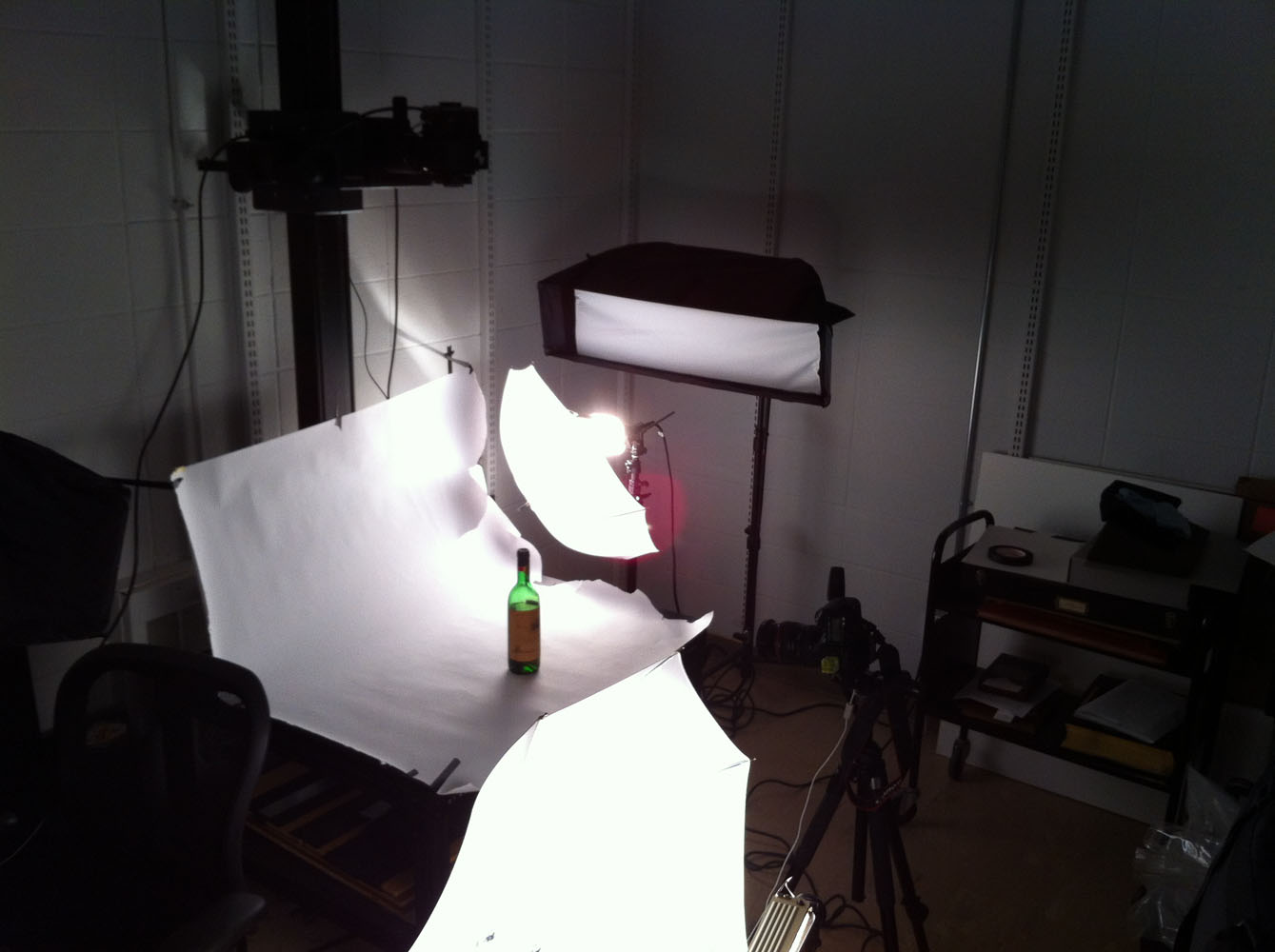
Wine bottle at the ready, I set up our reprographic camera stand to use as a shooting table. Because our strobes have narrow softboxes on them (perfect for documents and books, not so perfect for three-dimensional objects), I used our portable hotlights with umbrellas. Photographing glass is tricky; it’s best to light it from behind, using bounced light to give the object its shape and prevent distracting reflections. However, in this case I needed to show the glass, the liquid inside, as well as the label on the front. I used one light to illuminate the scene, with particular attention paid to the label. I used the other light as a handheld light; I held it by the light stand, and used a variety of angles and distances from the bottle to get the lighting I wanted.

In the interest of thoroughness, I photographed the bottle from the front, back, and sides. The most difficult shot was the back of the bottle, as the label prevented me from lighting through the bottle, and made the surface of the glass highly reflective. I could get myself out of the frame, but both the camera I was using and the one mounted to the top of the repro stand were visible in the glass. I taped white paper over the top camera, which solved the problem easily. The camera directly in front of the bottle needed a bit more work. Using the lens cap, I traced a circle onto a piece of paper. I then cut that circle out, and mounted the paper on the camera (using the lens cap gives you a good approximation of the lens size). The resulting image has the expected specular highlights and reflections, but has minimized the obvious camera/room reflections.

Wine-tent

Making the camera cover to reduce reflections.

The final images give a good sense of the bottle, the wine inside, and the label. To afford users a full view of the label, I combined three different shots of the bottle into one.

Front, back, and label views.

Front, back, and label views.

Next time, we’ll look at how we approached uncorking the bottle – and what its contents had in store for us.

Studio on the go

July 8, 2013 by | Comments Off on Studio on the go

The library Annex: known for housing a vast collection of books not stored in our on-campus libraries, it's also home to an art vault for Brown's portrait collection

The library Annex: known for housing a vast collection of books not stored in our on-campus libraries, it’s also home to an art vault for Brown’s portrait collection.

During the slower summer months, DPS has the time to turn its attention towards important projects that may not be as time-sensitive as work done during the academic year, but remain a vital part of the work of digitizing the collections of both the University Library and the larger institution. Many of these projects involve on-site work, where my colleague Ben and I travel to locations on and off campus to photograph rare and oversize objects.

One undertaking this summer has been work for University Curator and Senior Lecturer Robert Emlen, who has identified a number of paintings that require photography. Many of the works have been conserved, some have not been previously digitized, and several had been captured with older (c. 2003) digital technology.

Some of these paintings are part of the Rush C. Hawkins Collection, housed in the Annmary Brown Memorial. The majority of the works are from the Brown Portrait Collection, made up of paintings located all across the Brown campus. There are also a number of paintings stored at the library Annex, home to many volumes not currently stored on campus.

In order to capture these works as best as possible, we have a traveling setup that we bring with us. This includes our digital back, mounted on a medium format SLR, tripod, hot-shoe level, x-rite color checker card, tungsten light set with light stands and umbrellas, and a MacBook Pro with Capture One installed for tethered shooting. We also bring white foam core reflectors to even out lighting, and black foam core to reduce any unwanted light (which gives a nasty glare off oil paint). Below is a setup from a shoot in the Annex, where you can see most of this equipment brought into play.

shoot2

Here’s the full setup, with the tethered laptop.

Testing this shot with the color checker card and hot shoe level.

Testing this shot with the color checker card and hot shoe level. We’re purposely photographing the painting on its side to make the most of the camera’s 80MP sensor (without having to rotate the camera) as well as to ensure as even light spread across the painting as possible.


The painting we are photographing above is a portrait of Barnaby Keeney, the 12th president of the university. This is the final product:

Keeney, Barnaby Conrad (1914-1980) Artist: Feldman, Walter  Portrait Date: 1961 Medium: oil on canvas Dimensions: 4 Framed Dimensions: Brown Portrait Number: 201

Keeney, Barnaby Conrad (1914-1980); Artist: Feldman, Walter; Portrait Date: 1961; Medium: oil on canvas; Brown Portrait Number: 201

The portrait was painted in 1961 by Walter Feldman (himself a Brown institution, now Professor Emeritus of Art); an interview with Professor Feldman for a celebration of BREATHTAKEN, a new collaborative publication released in 2012, can be found here.

Photographing Clara

May 31, 2013 by | Comments Off on Photographing Clara

As a followup to last week’s post about John Hay, I thought it would be a good time to discuss photographing the portrait of Clara Stone Hay. The wife of Brown alumnus John Hay, Clara Stone Hay’s portrait hangs in the John Hay Library, where the university’s special collections are housed. I was charged to photograph the portrait for the 2010 edition of Special Collections of the Brown University Library: A History and Guide.

Hay

The John Hay Library, home to many of Brown’s Special Collections.

Photographing the portrait was no easy feat. The painting had to be photographed in place; it is too large and too heavy to move for photography. This made controlling many aspects of the lighting incredibly difficult. The painting is done in oils, which have a reflectance that can range anywhere from a slight slimmer to a strong glare. Additionally, the painting is behind glass – and decidedly not the anti-glare variety. Both these obstacles can be dealt with through careful placement of the lighting, including adjusting the angle and directionality of the lights to minimize reflections. However, this painting is in a marble hallway, with windows and reflective surfaces at every turn. While no windows shine directly onto the painting, the light that they bring into the hallway not only interferes with the lights I had brought to illuminate the painting, but they also create hot spots and highlights on the work itself. The other paintings and objects in the hallway also create their own reflections in the glass.

The hallway in the John Hay Library where the portrait of Clara Stone Hay was photographed. Clara's portrait is top right.

The hallway in the John Hay Library where the portrait of Clara Stone Hay was photographed. Clara’s portrait is top right.

A tilt-shift lens, showing the shift to the right (while maintaining parallel).

A tilt-shift lens, showing the shift to the right.

I’m a big believer in preempting as many imaging issues as possible during the actual capture. Because I had scouted this painting beforehand, I knew about the glass and the lighting issue. The primary challenge with the painting being behind glass is that there’s no way to photograph the painting straight on, without myself or the camera (or both) being directly reflected in the image. I brought in my tilt-shift lens (also called perspective control, described here) so that I could photograph the painting from the side.

The t-s lens allows the photographer to photograph an object from the side, above, or below, with keeping  the lens parallel to the object (otherwise, we would see great distortion). This is called shift: the lens and film plane/digital sensor are parallel to the object and to each other, but the image circle shifts within the camera, allowing you to capture a different area of the scene than that which is directly in front of you.

I took multiple shots with the tilt-shift lens, bracketing for exposure. I was able to capture a faithful reproduction of the painting, which required very little processing. I had to fix some minor distortion on the right side of the frame – an artifact of the lens not being 100% parallel with the painting. I also had to reduce some of the reflections on the painting which were unavoidable – the painting opposite that of Clara could not be moved, and could not be removed during capture. The progress of these changes and the final version are shown below.

The stages of processing the Clara Stone Hay portrait.

The stages of processing the Clara Stone Hay portrait.

Ninety degrees of separation

March 22, 2013 by | 1 Comment

When I joined Digital Production Services as a photographer in 2008, one of my first projects was a 15th century bible in the collection of the Providence Public Library. The PPL has a significant Special Collections department, and this bible, Biblicum memoiriale emblematicum, is just one of “over 40,000 books, manuscripts, pamphlets, ephemera, newspapers, maps, broadsides, art, and artifacts, representing over four thousand years of human history and culture.” (PPL website) This relatively small (10.5 x 7.6 cm) bible is handwritten, and many sections are composed of paneled illustrations as if it were an early graphic novel format.

The first step in photographing any rare or fragile material is to consult Preservation. My colleague and I immediately brought the book to our preservation specialist to determine both the best overall handling procedures, as well as any shooting restrictions. The book itself was in remarkably good condition; the main caveat was that the book should not be opened more than 90˚ to preserve the spine. We would have to build a foam structure to support the book and ensure that at no time was there any stress on the spine or the pages.

We also had to take into consideration the specific digitization guidelines provided by the institution that would eventually house the digital version of the bible. The images were headed for the Digital Scriptorium, an online image database for medieval and renaissance manuscripts. Each image required a color target (which we include in every image, but usually crop out for display versions), a grey background, and full-spread views rather than page-by-page views. This was actually helpful for us, since given the handling restrictions on the book, we had to shoot full spreads.

foam-supportMy colleague and I decided it would be best to photograph the object using our glass book cradle. Normally, this cradle is used to photograph one page at a time; it holds the book open to a given page, pressed flat against the glass, and supported underneath by a platform that can be raised or lowered to accommodate different thicknesses. In this case, however, we were using the cradle to house the foam supports for the bible, and to very gently hold the book open; no pressure was put on the bible at all. My first task was to build the foam support, as the entire object needed to be surrounded by protective foam. I cut various strips of foam from larger sheets to reinforce the spine as it rested on the book cradle platform. Next, I cut more strips that I folded and secured with tape to support the back and front of the book, with special attention paid to the areas just beyond the spine. The image below illustrates the foam structure, with a large foam block, stacks of foam and other objects surrounding the support for the grey cloth background to rest on.

 
The next issue that I quickly ran into was that while the book would stay open with very little pressure, it was impossible to keep it open to a given page. To keep the book open would have required using pressure on the book, something that was out of the question in this case. To solve this problem, I created a system where I could place a piece of transparent thread across a page of the book to carefully hold the page in place. I brought in the clear thread, and taped each end to a pencil. I found some large binder clips, which I attached to the book cradle both above and below the book (rather far away so that the thread would not dig into the page). I put each pencil through the metal clip of the binder clip, rotated the pencils to achieve the proper tension, and then locked the clips into place. This allowed me to hold each spread open without damaging the book or interfering with its legibility.

setup-main


Once I knew I could support the book and keep it open to each spread, all I had to do was ensure that the lighting was as even as possible (even into the gutter), and that my focus level was about one-third of the way into the book, so that the focus would be consistent across the pages. Below is an example of the final product; a page from Exodus. You can view the entire book at the Digital Scriptorium.

Exodus

Illuminating Postcards

February 13, 2013 by | 2 Comments

Arcade

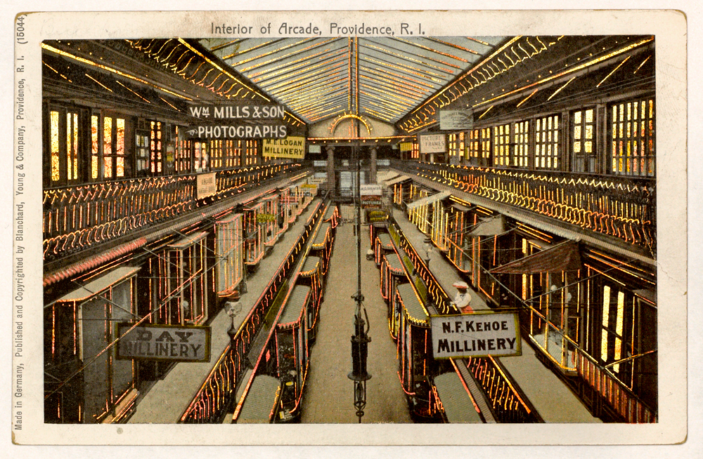
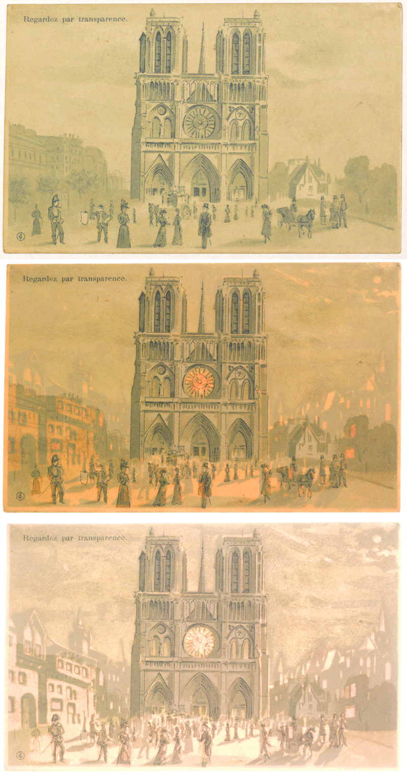
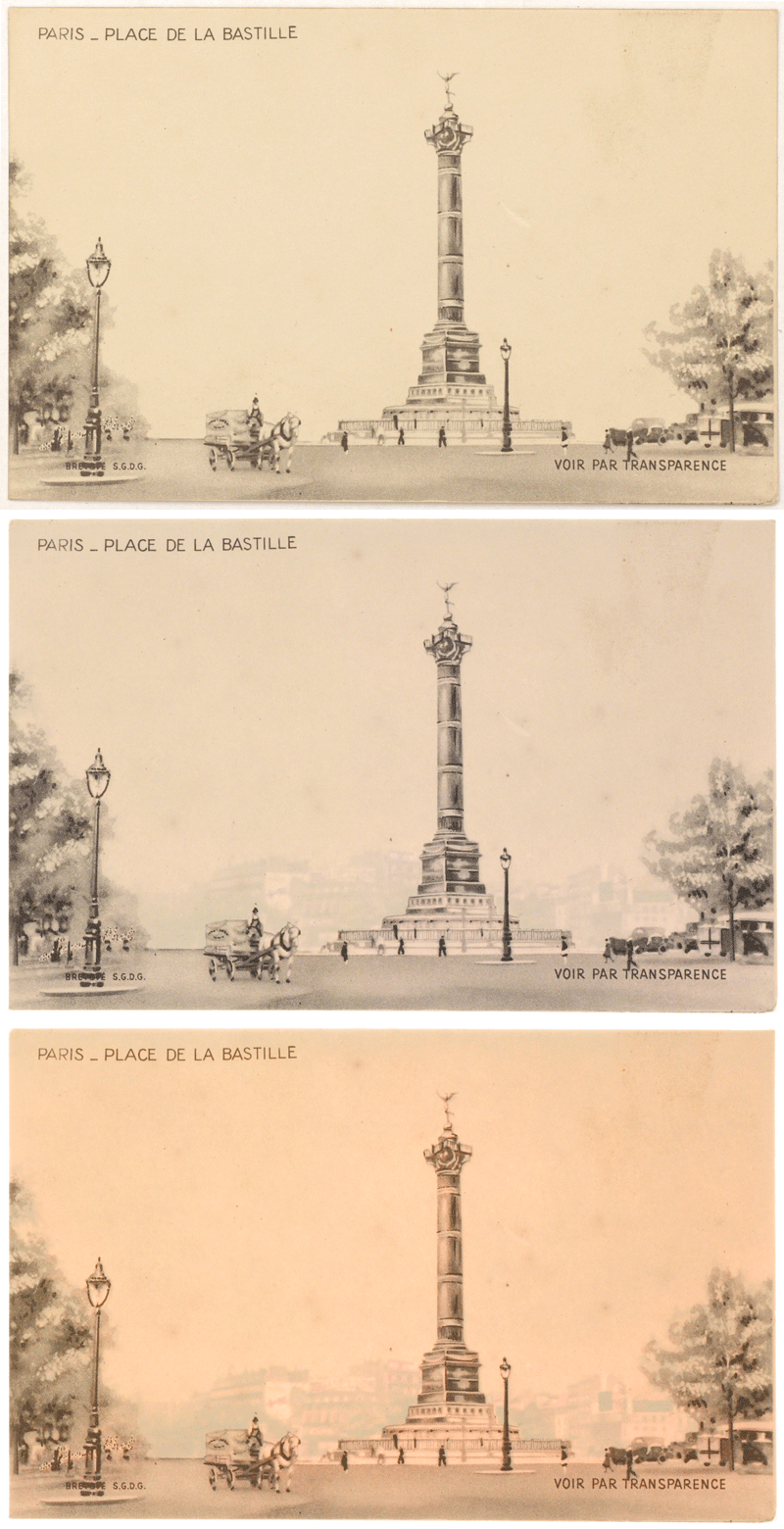
While I generally work with objects and texts from Brown’s Special Collections, I also work with images for the instructional image collection with Karen Bouchard, the Scholarly Resources Librarian for Art and Architecture (she has a Twitter feed for the Brown Imaging Blog). These are images scanned for faculty members (primarily in History of Art and Architecture and Visual Art). For this project, I was digitizing postcards in the personal collection of Brown alumnus Seth Cohen, lent to Professor Dietrich Neumann for use in his lectures. These postcards – representing a range of locations and time periods – look at first like ordinary postcards, but illuminate in specific areas in the card when backlit. Sometimes, the backlighting shines through windows and doors in a bright, copper color; other times, the light brings forth a part of the image unseen when viewing normally.

The following are two animations of illuminated postcards: they start with the postcard lit normally, then move to two different strengths of backlight.

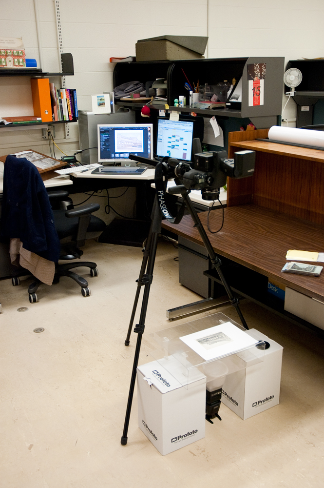
While it’s relatively easy to view one of these postcards – holding them up to a window or to a bright indoor light does the trick – capturing that in a photograph is much more challenging. After some trial and error, I devised a simple system to backlight the postcards with a light strong enough to show the layers of information, while still providing enough ambient light to read the information on the front of the card. I set up our Leaf Aptus II-12 digital back on its medium format camera, attached it to a tripod set to shoot straight down, and did tethered capturing into Capture One (the software we use to capture using our Leaf digital back). I used two Canon 580EXII flash units; one mounted on the hot shoe of the camera, and one functioning as a synched flash on the floor with a Gary Fong Lightsphere diffuser. I used an acrylic box to lay the postcards on, and put that on some boxes so that there would be some room between the flash on the floor and the postcards. I bounced the flash on the camera off the ceiling, so that it would provide a diffused ambient light that would neither overpower the postcards, nor cancel out the backlighting.